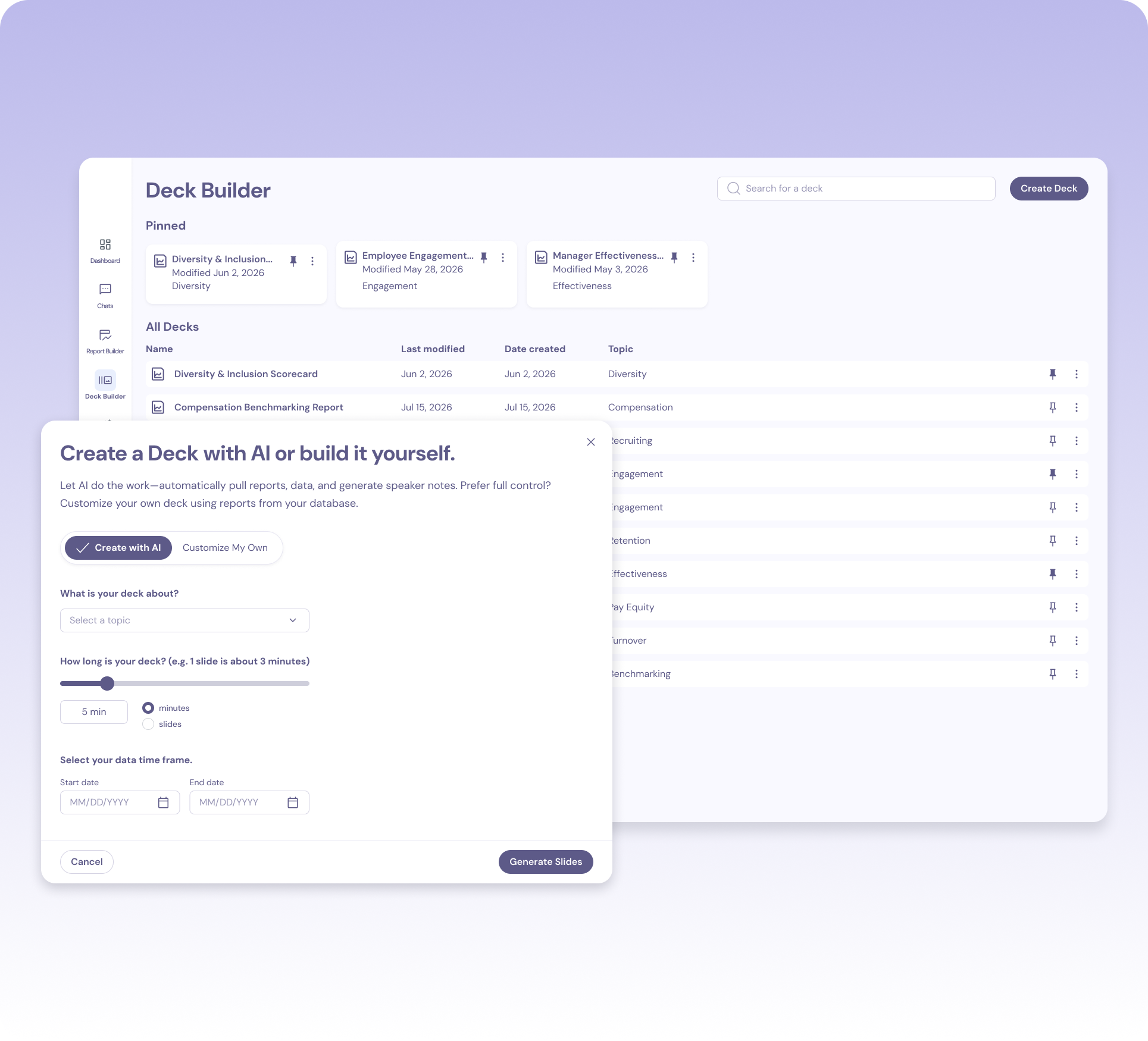
HR teams and business partners build stakeholder decks almost every day — and rebuild them every time the data changes. I designed the AI system behind an executive-ready presentation builder, from first draft to final send.
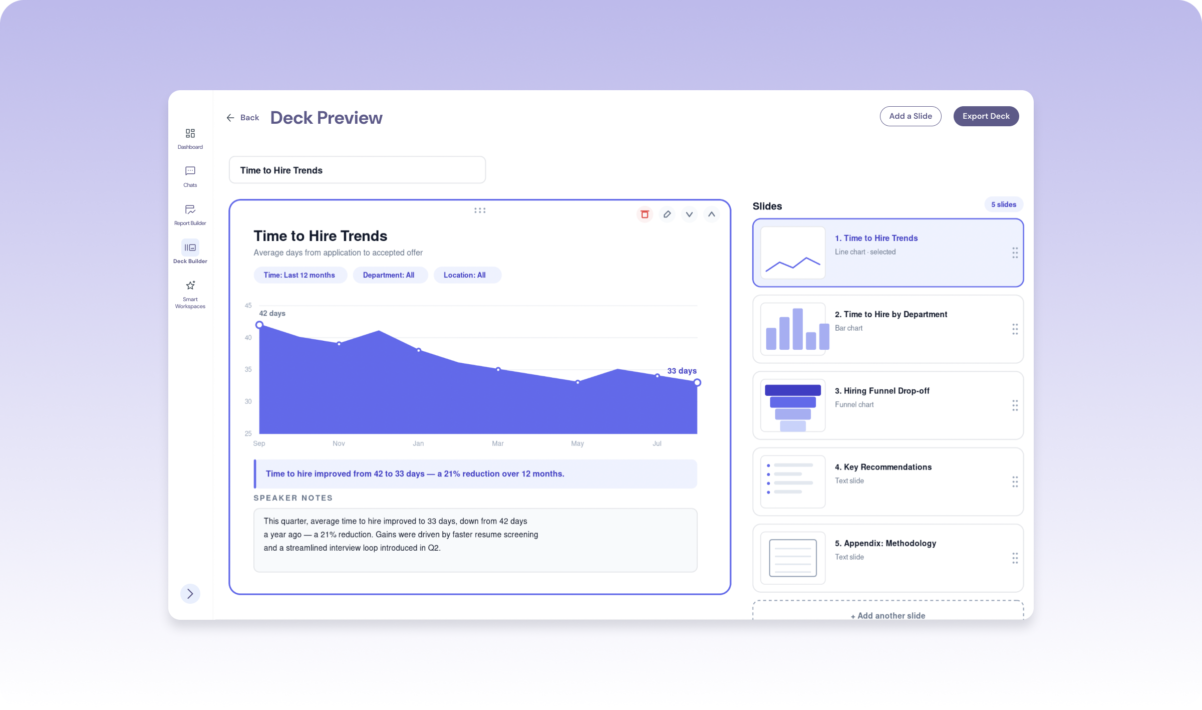
HR business partners spend hours almost every day building and rebuilding stakeholder presentations — pulling numbers, choosing charts, writing talking points, formatting slides. It's one of the biggest time sucks in their role, and it never really ends: the data changes, so the deck has to change with it.
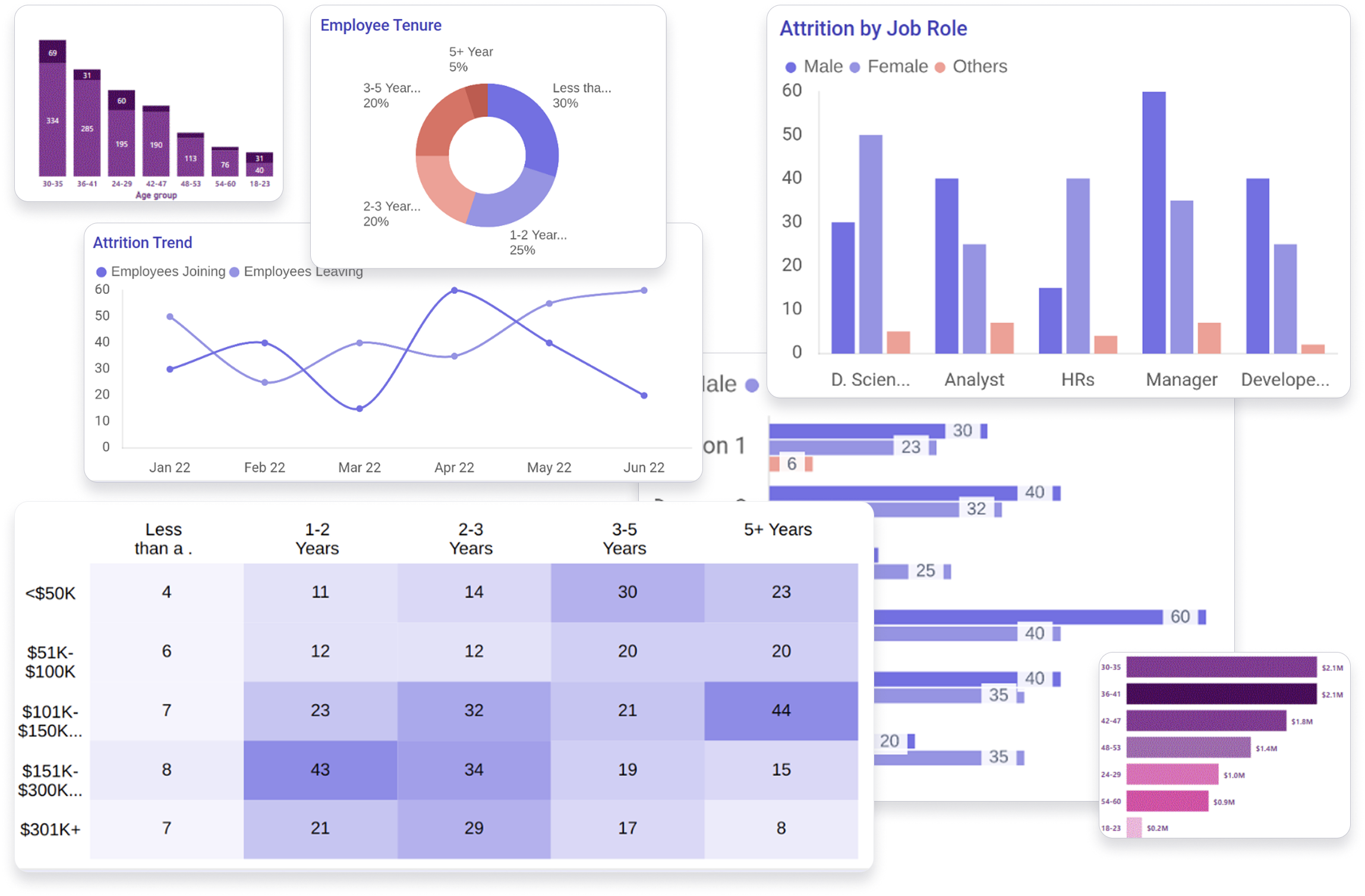
My client owned a workforce data platform that gave companies visibility into their own workforce — attrition, representation, time to hire, and the areas where they had room to improve. So the data itself was never the problem — it already lived in the system. The opportunity wasn't generating slides faster. It was helping users go from raw data to a meaningful story, with confidence, and without starting from a blank canvas every time.
Not a blank canvas — a draft they could shape into their own story.
Users shouldn't need to know chart theory to explain their data well.
AI could accelerate the first draft — the final story stayed theirs.
The question wasn't "how do we generate content?"It was "how do we help users trust — and improve — what AI creates?"
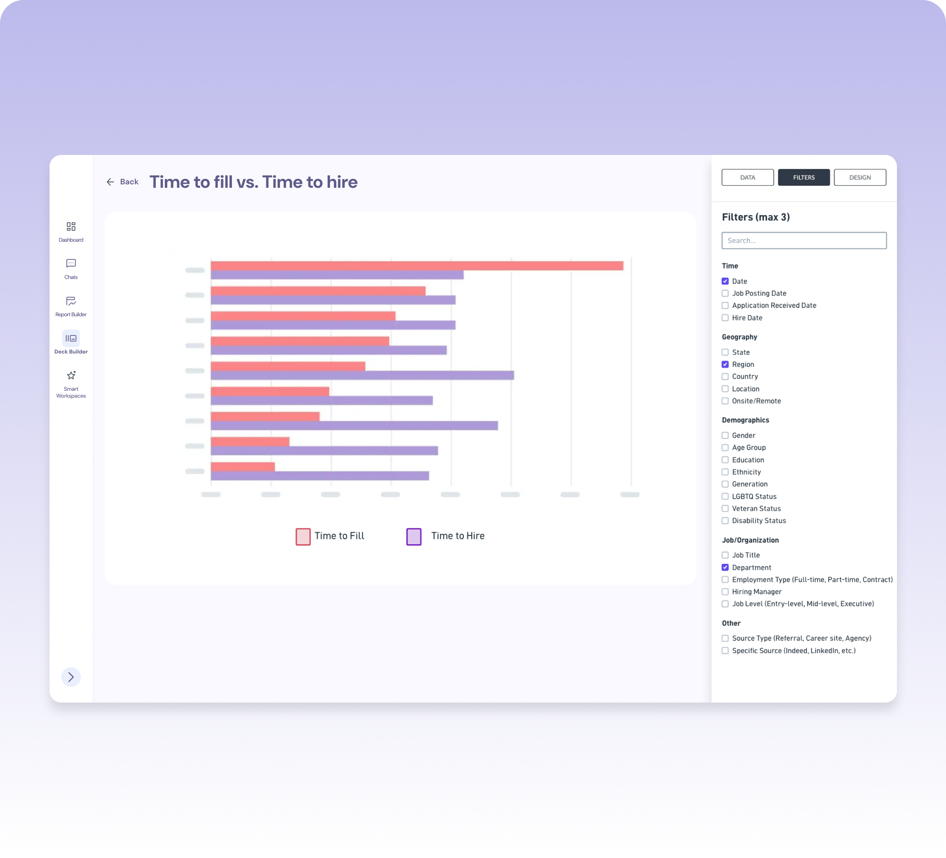
This client sold to all kinds of businesses. Some customers would have access to their entire company's data. Others would only see a slice of it. And even within one deck, the right way to visualize a topic could shift completely depending on which filters were applied.

Some users see everything. Some see one slice. Filters had to be anticipated, not assumed.

Some filter combinations call for a bar chart. Others need a spider chart to tell the same story clearly.

A chart alone doesn't tell an executive anything. Someone still had to write what it meant.
Every decision came back to these three principles.
We mapped what data each type of client would realistically have, and proactively decided which filters to surface for them.
The chart type follows the topic and filters — not the other way around. The visualization should explain the data, not decorate it.
Every chart, every note, every slide AI created stayed fully editable. Speed never came at the cost of control.
We knew from day one this client would sell to all types of businesses — some with access to a company's full data set, some with only part of it. Instead of building one static set of filters for everyone, I mapped out what each type of client's data would realistically look like, then designed the filter logic to proactively surface the right options for that user before they ever had to think about it.
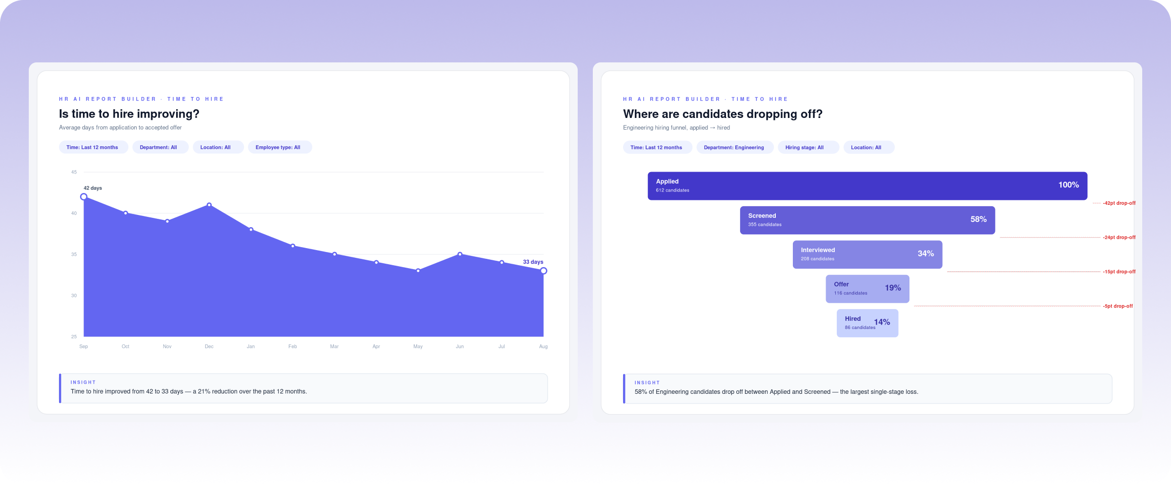
Comparing categories usually calls for a bar chart — but the right set of filters on the same topic might actually be clearer as a spider chart. Rather than leave that call to users who might not know the difference, I worked with the team to define logic mapping each topic-and-filter combination to the visualization that explained it best. Users never had to think about chart theory. The deck just showed up looking right.
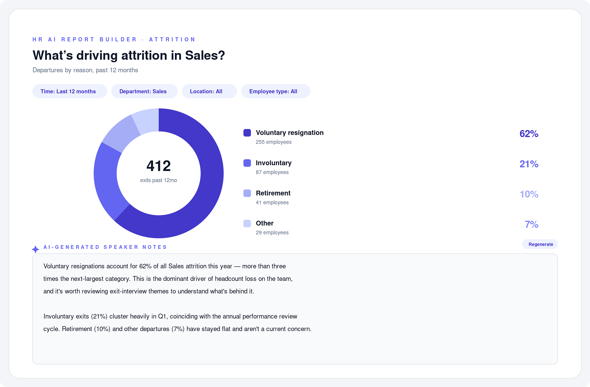
Building the charts wasn't the only time suck — users also had to write the talking points for every slide. I designed AI-generated speaker notes for each chart, giving users a starting narrative for every slide they could edit, rewrite, or approve as-is. The writing bottleneck disappeared right alongside the chart-building one.
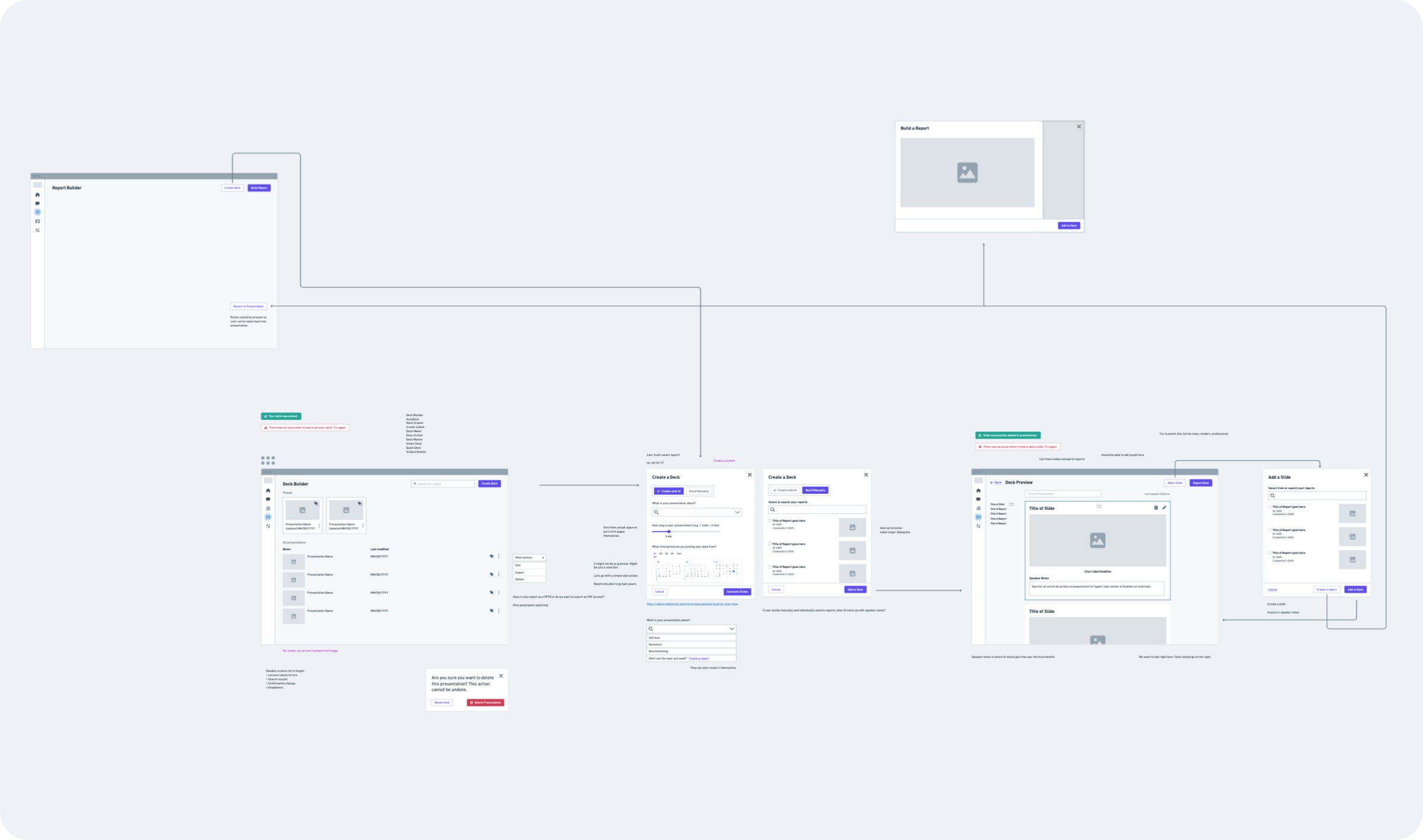
Working fast in low-fidelity is what made this timeline possible. I could validate direction with stakeholders before investing in any polish.
Ran stakeholder discovery, then used AI to turn raw notes into structured user needs — fast.
Mapped the user flow and built low-fi wireframes in Whimsical, moving quickly because nothing was precious yet.
Shared low-fi concepts with the client to validate direction before investing in detail.
Built the final UI and worked out the chart-selection and filter logic with the team, using AI to help compile which chart fit which topic and filter set.
Users go from raw workforce data to an editable executive deck without starting from a blank canvas.
No more guesswork for users who don't know chart theory — the system recommends the visualization that fits the data.
Users can revisit any AI-built presentation, keep editing it, or send it again — a living asset instead of a one-time export.
Designing AI products means balancing two competing needs: efficiency and trust. The best AI experience doesn't remove the user from the process — it gives them a stronger starting point while preserving the judgment that makes their work valuable. That showed up everywhere here: in the filters we anticipated, the charts we chose on the user's behalf, and the speaker notes we drafted so people could edit instead of starting from nothing.
It also shaped how I worked. Using AI to synthesize discovery notes and move quickly through low-fidelity is what let one designer take this from kickoff to delivery in four weeks.