
Sales representatives at this lighting retailer's showrooms used the company website as their main selling tool — searching for fixtures from dozens of brands, live, next to a customer. But the site worked against them: slow load times, broken images, and almost no way to filter a massive catalog. I redesigned the experience around fast discovery, flexible organization, and the ability to turn saved products into a client-ready presentation in minutes — all within a fixed budget of 60 design hours.
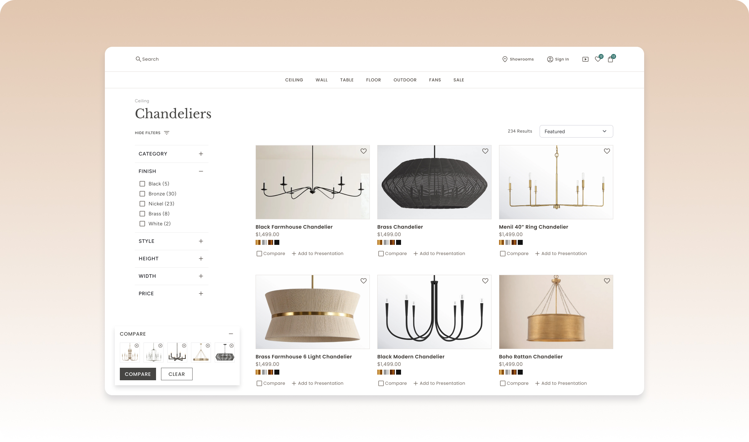
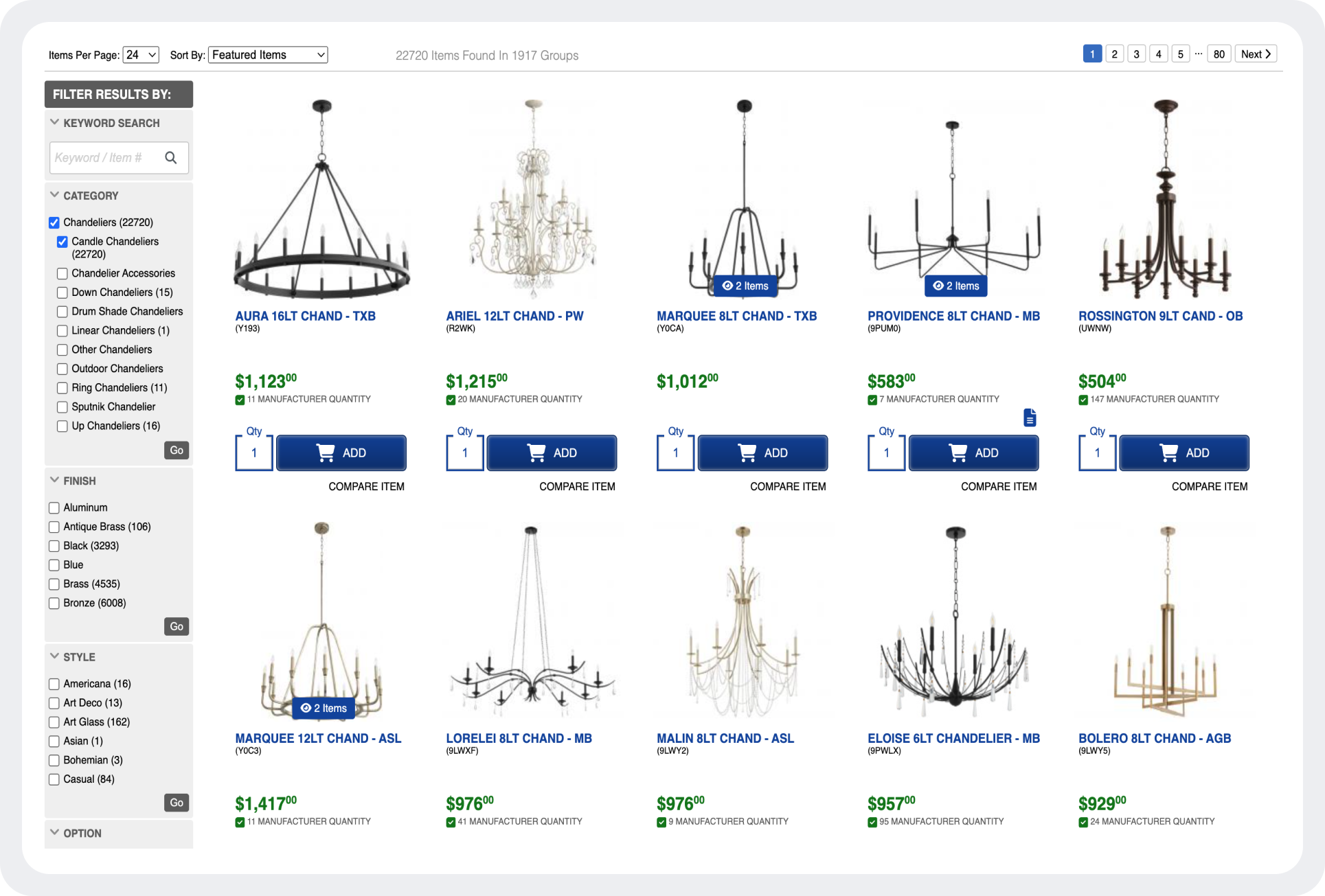
This product had two very different users sharing one interface: customers browsing in the showroom, and sales reps searching alongside them in real time. Every piece of friction wasn't just a UX annoyance — it was a stalled sales pitch. Products were hard to find, filtering was minimal, images often failed to load, and the catalog itself spanned dozens of lighting brands with no consistent way to filter across them.
The challenge wasn't improving an ecommerce site. It was designing a tool a sales professional could rely on while standing next to a customer deciding whether to buy.
Through stakeholder conversations and workflow mapping with the sales team, three behaviors consistently shaped the redesign:
Sales conversations move quickly. Reps needed to narrow thousands of fixtures into a handful of relevant options within seconds, live, in front of a customer.
Every sales rep managed multiple builders, designers, and homeowners at once — often several active projects in parallel. Scattered bookmarks and notes weren't going to hold up.
Customers rarely picked the first fixture they saw, and the sales process didn't end at the showroom — reps needed to leave a meeting with something polished to send the client afterward.
Give sales reps enough filtering power to go from thousands of fixtures to a handful of relevant options in seconds, without breaking the flow with a client.
Let sales reps organize saved products the way they actually worked: by client, by project, by room — not a flat, unsorted list.
Let a saved list become a polished, branded presentation reps could leave every client meeting with.
Taken together, these constraints meant this couldn't be a from-scratch overhaul. The redesign had to fit inside a fixed time budget, serve two very different users through the same interface, and feel fast and low-friction on its own — all before any backend performance work happened.
The entire redesign — research, IA, UX, UI, and engineering collaboration — had to fit inside a fixed design budget, delivered across a couple of months.
Casual customers and sales reps managing dozens of projects needed to share one product, not two.
Casual favoriting couldn't require a login, but sales reps' project tools genuinely needed one.
The old site's slow loads meant the new IA and interactions needed to feel fast on their own, ahead of backend fixes.
Filtering had to support the vocabulary and speed a sales rep actually works in: style, finish, room, dimensions, availability.
Saved items needed to function as real project folders — organized by client and by room — not a simple wishlist.
Turning a list into a presentation needed to take minutes, not hours, and casual browsing shouldn't require an account just to save a favorite.
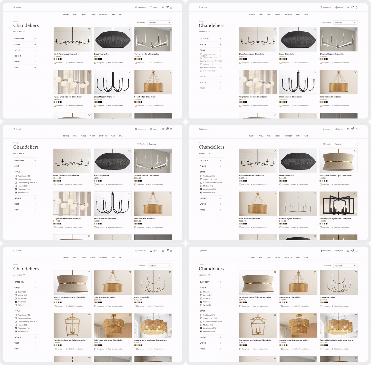
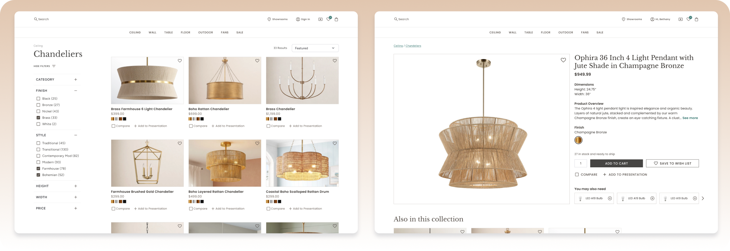
The original navigation made it difficult to browse a large, multi-brand catalog. I restructured the information architecture and introduced filtering and sorting by style, finish, room, dimensions, availability, and other attributes sales reps actually think in — attributes that worked consistently no matter which of the dozens of brands a fixture came from. Instead of searching through hundreds of products, users could surface the few that matched a client's needs in seconds.
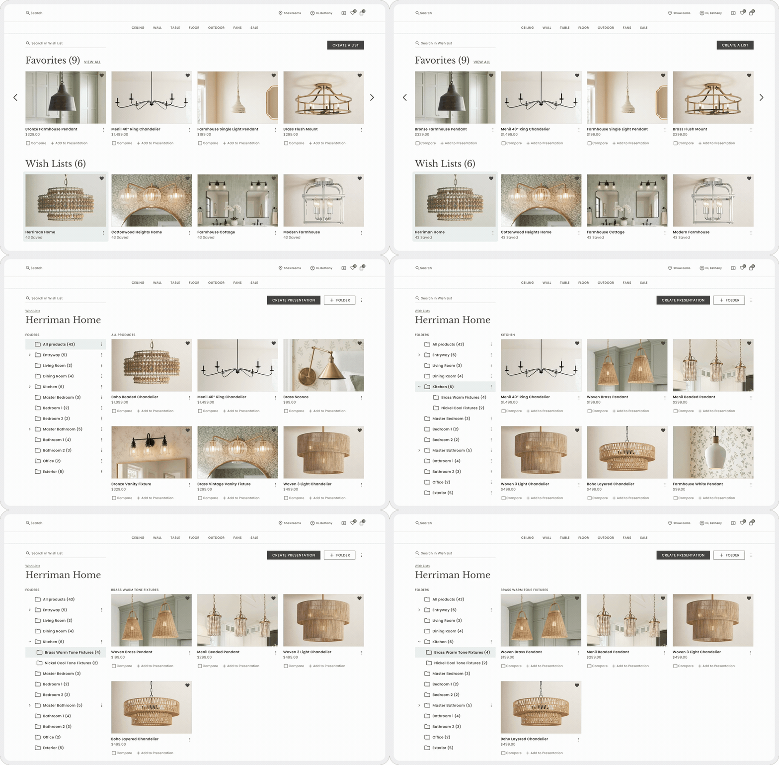
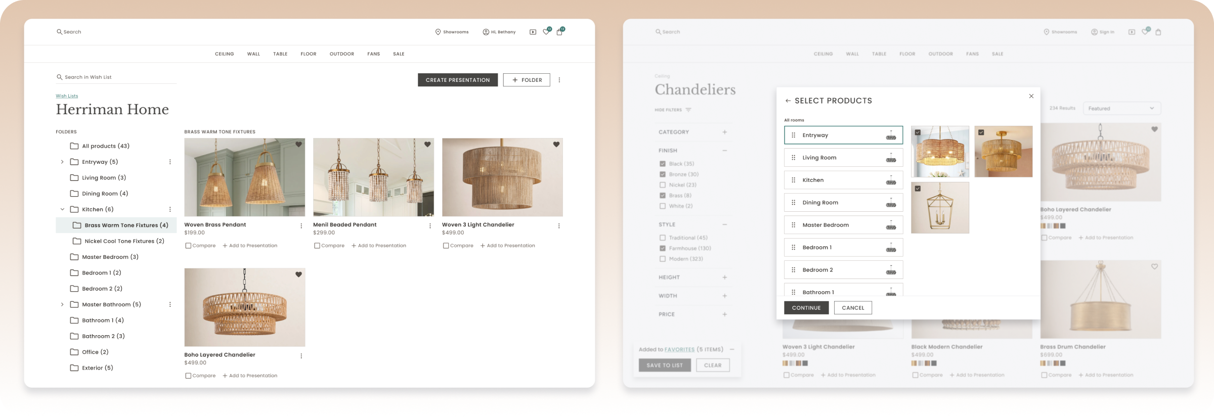
Sales reps were managing dozens of active client projects, not just favoriting products. I designed a system where hearting a product let reps tag it by room, automatically organizing each list into sections like kitchen or bedroom lighting. Reps could nest lists within lists to keep multiple curated options organized per client, duplicate a project to start a similar one, and share a single list without exposing the rest. It turned "favorites" into a real project-management tool.
Sales reps needed to turn a saved list into something they could hand a client, fast. My first concept was simple: select a list, pick one of four styled templates — Modern, Minimalist, Elegant, or Utilitarian — and the system would generate a presentation automatically, room by room, that the rep could then drag and rearrange into the order they wanted.
I reviewed that concept with the client at mid-fidelity, before any of it was built, and it didn't land: reps would still end up doing a lot of manual rearranging after every presentation was generated. So I redesigned the flow before it ever went to engineering, moving more of those decisions earlier instead.

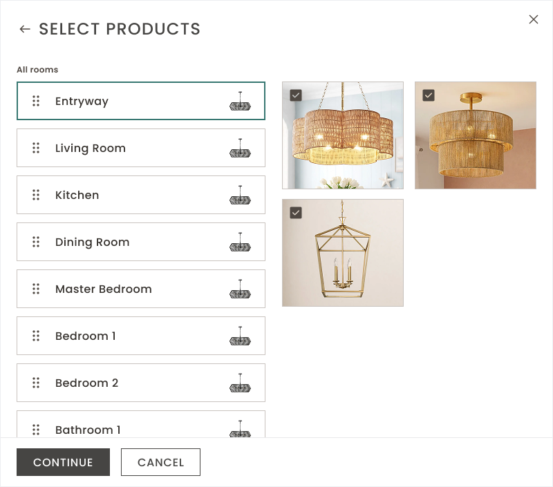
After selecting a list, the rep saw every product already organized by room. They could deselect anything they didn't want included, reorder entire rooms and more.
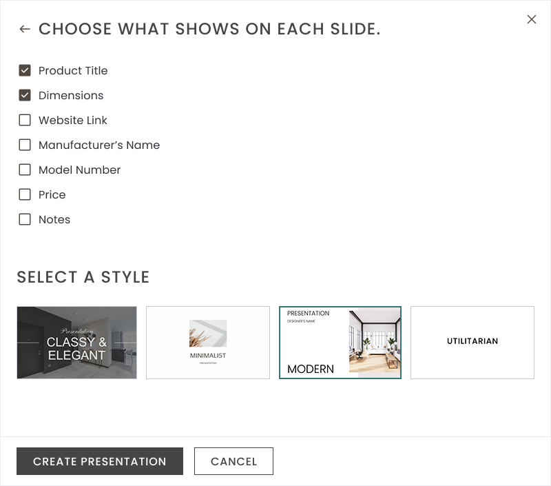
The rep chose what information would actually show on each slide, images only, or images plus dimensions, price, and product title, depending on how much detail that client needed to see.
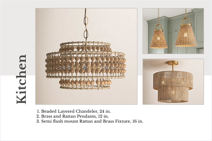
The presentation was built instantly, ready to share with the client on the spot.
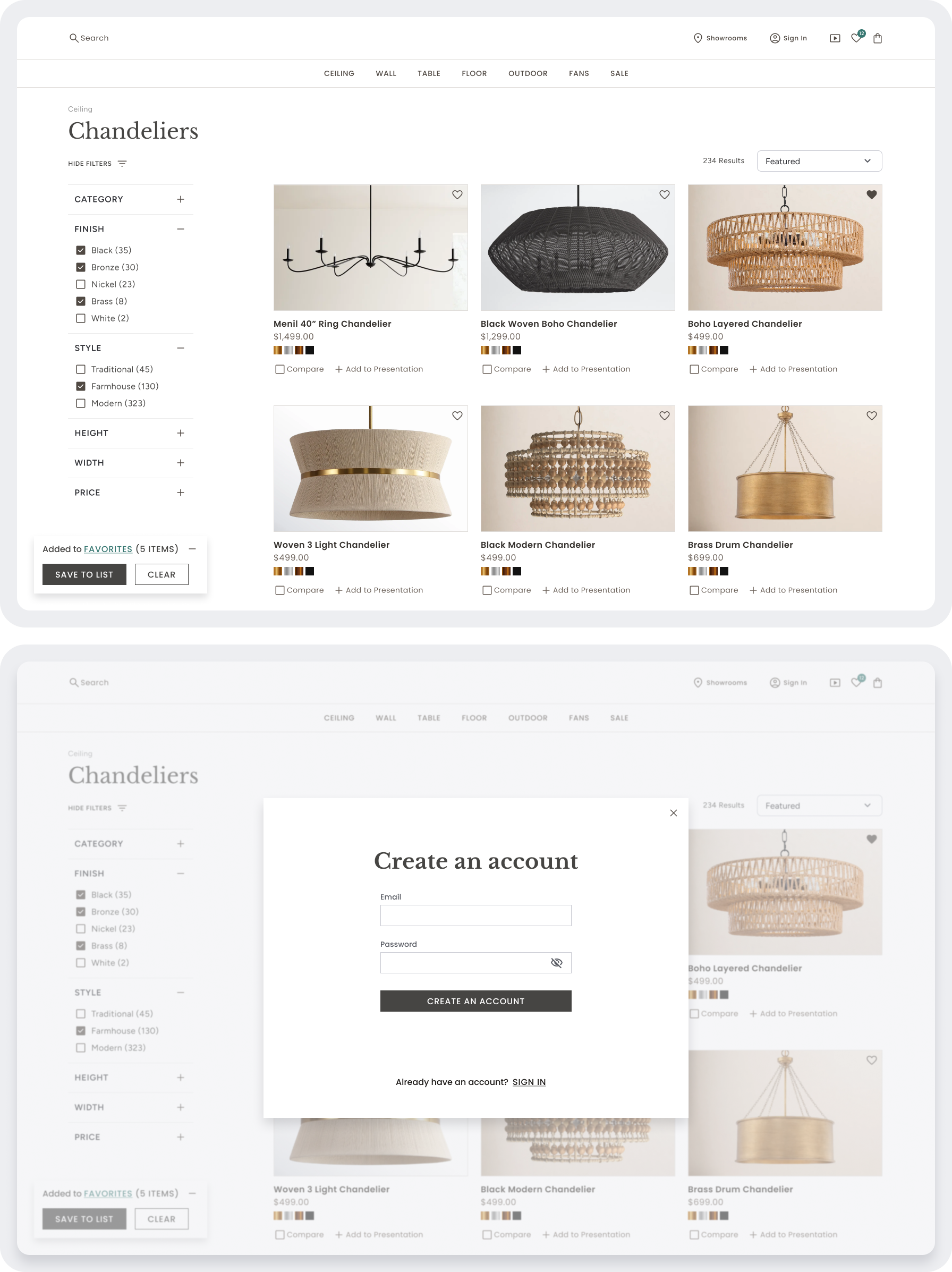
Most visitors browsing the site — whether a customer standing in the showroom or someone browsing later at home — weren't ready to create an account, and forcing one would have killed casual engagement. I designed favoriting so that hearting a product to the default favorites list required no login at all; it was remembered locally on the device. Only when someone wanted to create a custom, named list — the kind a sales rep needed for real project organization — did the product ask them to create an account. This kept the low-friction path genuinely low-friction, while still supporting the more powerful, structured organization that sales reps depended on.
A product discovery experience built for collaborative selling.
Fast filtering and intuitive navigation narrow thousands of fixtures into relevant options in seconds.
Products tagged by room and organized into nested lists, so reps can manage multiple projects, duplicate one to start a new project, or share a list with a client.
A guided flow turns any list into a styled presentation in one of four themes, with product details pulled straight from the catalog.
Anyone can heart a product with no login required; creating a custom, organized list is the only moment that asks for an account.
Side-by-side comparison of finishes, dimensions, specs, and availability, so reps and customers can evaluate options without leaving the conversation.
Stock, dimensions, compatible bulbs, and coordinating fixtures at a glance, with one-click actions to add to a presentation, wishlist, cart, or comparison.
I handed this off at delivery and wasn't in the room for implementation, so I don't have usage numbers to point to. But the redesign was built to deliver a few concrete shifts in how sales reps could work:
Reps could narrow thousands of fixtures down to a relevant handful in seconds instead of manually paging through a slow, sparsely-filtered catalog.
What used to be retyping product names, dimensions, and pricing into slides by hand became a guided flow where every detail was pulled directly from the site's product data.
Not just a favorites shelf — reps could run multiple client projects at once, duplicate one to jump-start a similar project, or send a client a curated list.
The two-step presentation flow didn't come from something shipping and falling short — it came from a mid-fidelity concept the client reviewed and didn't love. I don't ship anything without a client's full sign-off, so when that first concept didn't land, I redesigned it before any of it reached engineering. The extra round of design happened at the cheapest possible point to make it, and the project still landed exactly on schedule.
Catching the wrong direction before it's built doesn't cost you time. Shipping it would have.