
Designing a Collaborative Travel Planning App (MVP → App Store Launch)
Overview
Planning a trip with friends often means juggling group chats, shared notes, screenshots, saved TikToks, and endless links. Valuable ideas get buried, planning responsibilities fall on one person, and there's no single source of truth.
Our goal was to create a mobile app that brought every part of the planning process into one collaborative workspace—from brainstorming destinations to building an itinerary together.
As both Product Manager and Lead Product Designer, I led the product from early discovery and strategy through UX research, interaction design, visual design, and launch on both iOS and Android.
Discovery
Rather than jumping directly into design, we began with several collaborative discovery and sensemaking workshops with stakeholders.
Together we explored:
- Business goals
- User needs
- Primary personas
- Jobs to be Done
- Success metrics
- Product vision
- Technical constraints
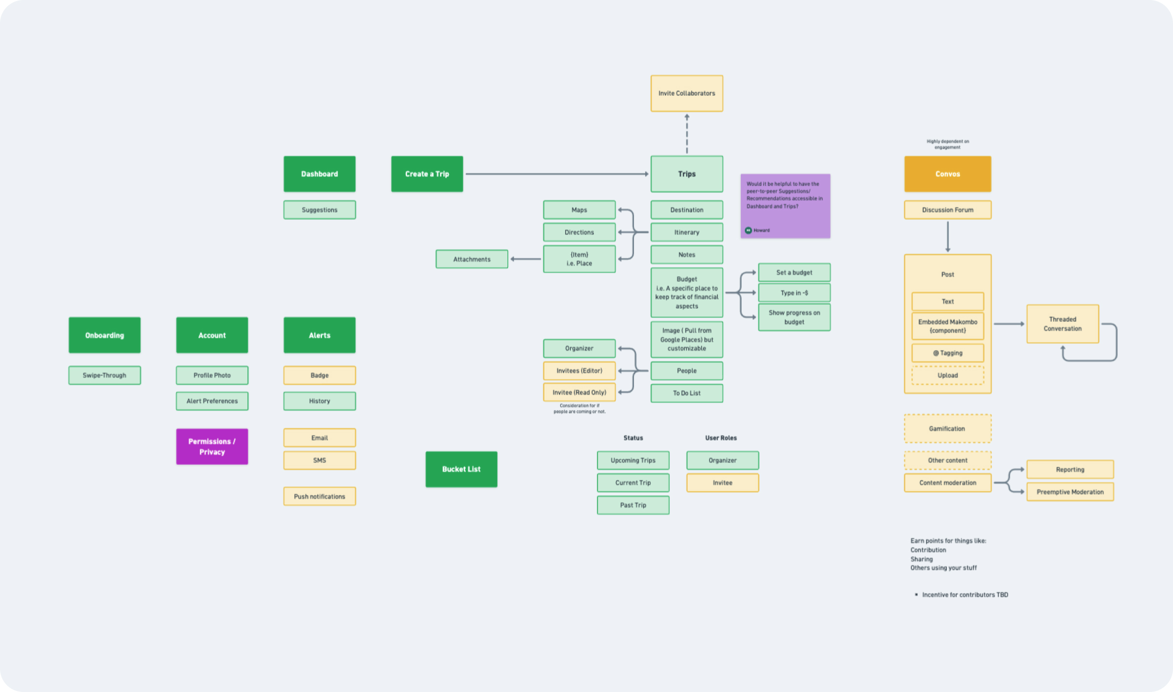
These sessions helped align everyone on what problem we were actually solving before discussing interface solutions. From there, I organized the product into a high-level sitemap and feature inventory.
One of the biggest exercises was determining which features belonged in the Minimum Viable Product versus what could be postponed for future releases. This ensured we could launch quickly while still delivering meaningful value to users.
Understanding the Problem
Before designing screens, I wanted to understand how people actually planned vacations today. I conducted competitive research on existing travel planning tools, analyzing where they succeeded and where they created friction.
Common themes emerged:
- Planning happened across too many apps
- Information became fragmented
- Collaboration was difficult
- Itineraries were often created manually
- Most products focused on booking rather than planning
These gaps helped define opportunities where our product could differentiate itself.
Research & Validation
Instead of immediately designing polished interfaces, we created low-fidelity wireframes and an interactive prototype in Whimsical. Our goal wasn't to validate UI—it was to validate product ideas.
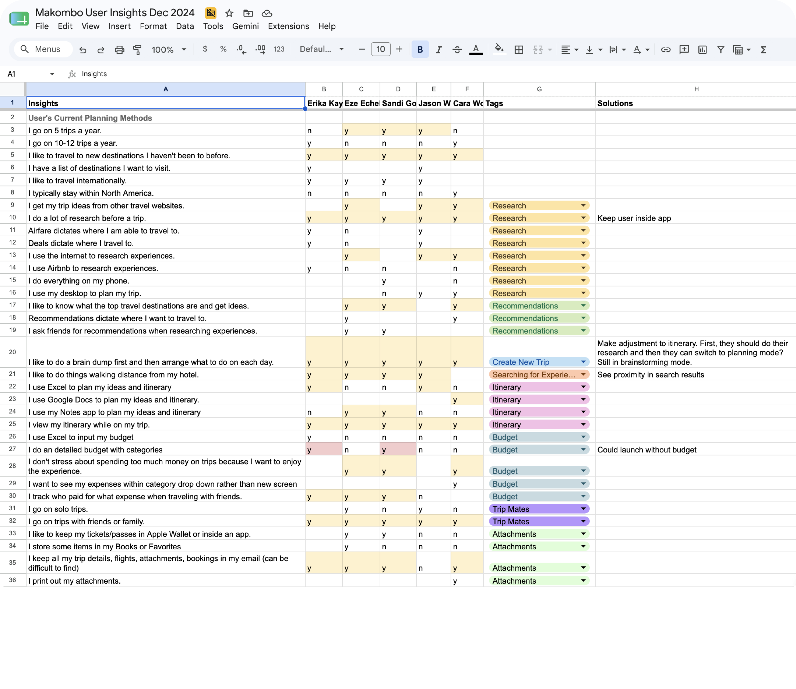
I conducted moderated interviews with five potential users, asking them to walk through how they currently planned vacations before testing our prototype. We learned much more than expected.
Key Insights
Location matters
People wanted recommendations based on where they were staying. They naturally organized trips geographically to reduce travel time between activities.
Planning happens in two phases
Users preferred to first collect ideas in a "brain dump" without worrying about dates. Only later did they organize activities into an itinerary.
Traveling is different than planning
While planning, users wanted to see the entire trip. While traveling, they only wanted to focus on the current day, with quick access to relevant details.
Collaboration is messy
Everyone wanted to contribute ideas, but coordinating opinions across group chats became frustrating. Groups struggled to decide what should actually make the itinerary.
Research overload
Users spent hours browsing blogs, social media, Google Maps, TikTok, and Instagram. Their biggest frustration wasn't finding ideas—it was keeping everything organized in one place.
Watching participants interact with our prototype also exposed usability issues that wouldn't have surfaced through interviews alone.
Iteration
Research fundamentally changed our direction. Rather than moving directly into visual design, we returned to the whiteboard. We revised our user flows, simplified several interactions, and reworked the information architecture to better support the planning behaviors we observed.
I created multiple rounds of low-fidelity wireframes to test different navigation patterns and workflows before committing to high-fidelity designs. This iterative process helped us validate key decisions early, saving development time later in the project.
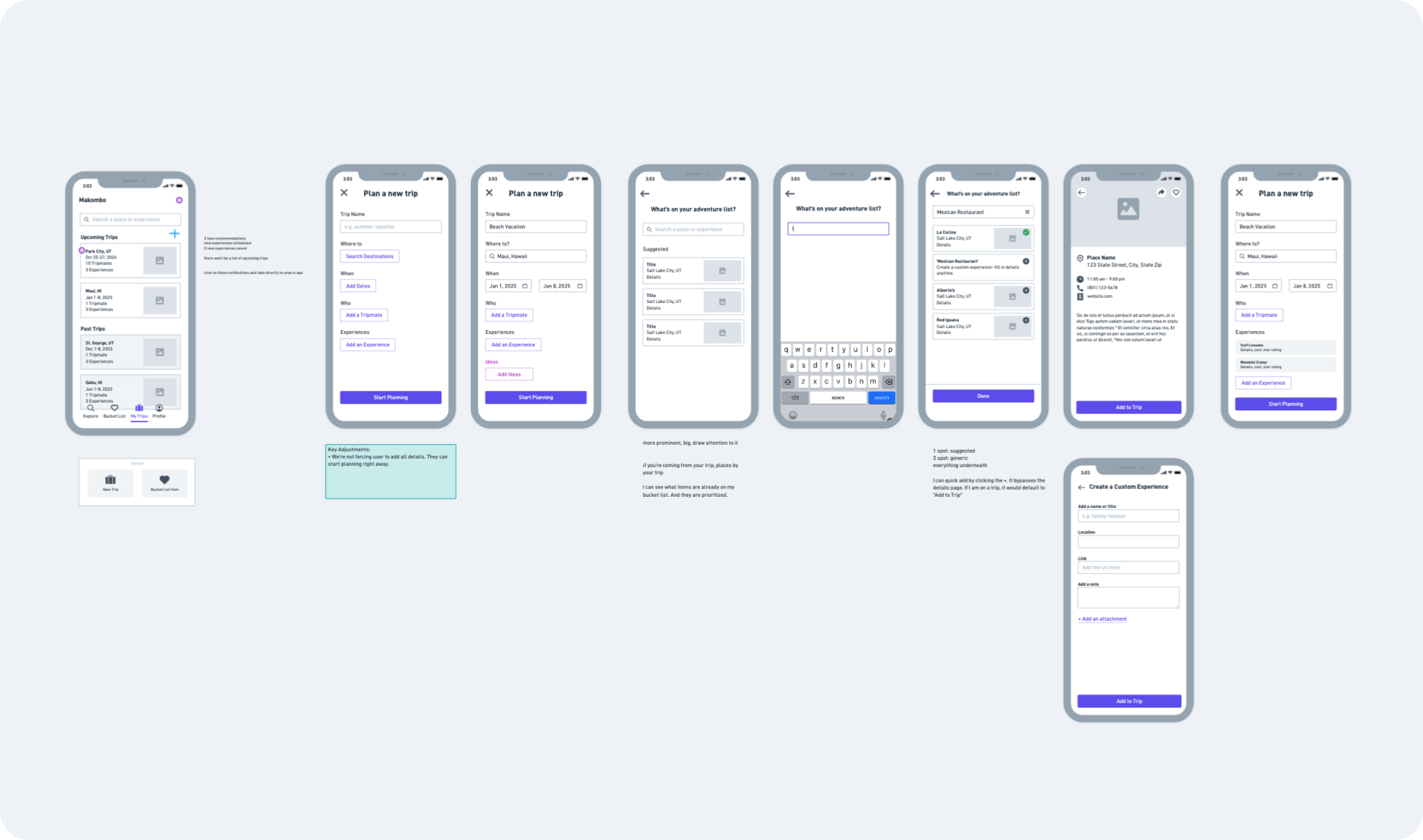
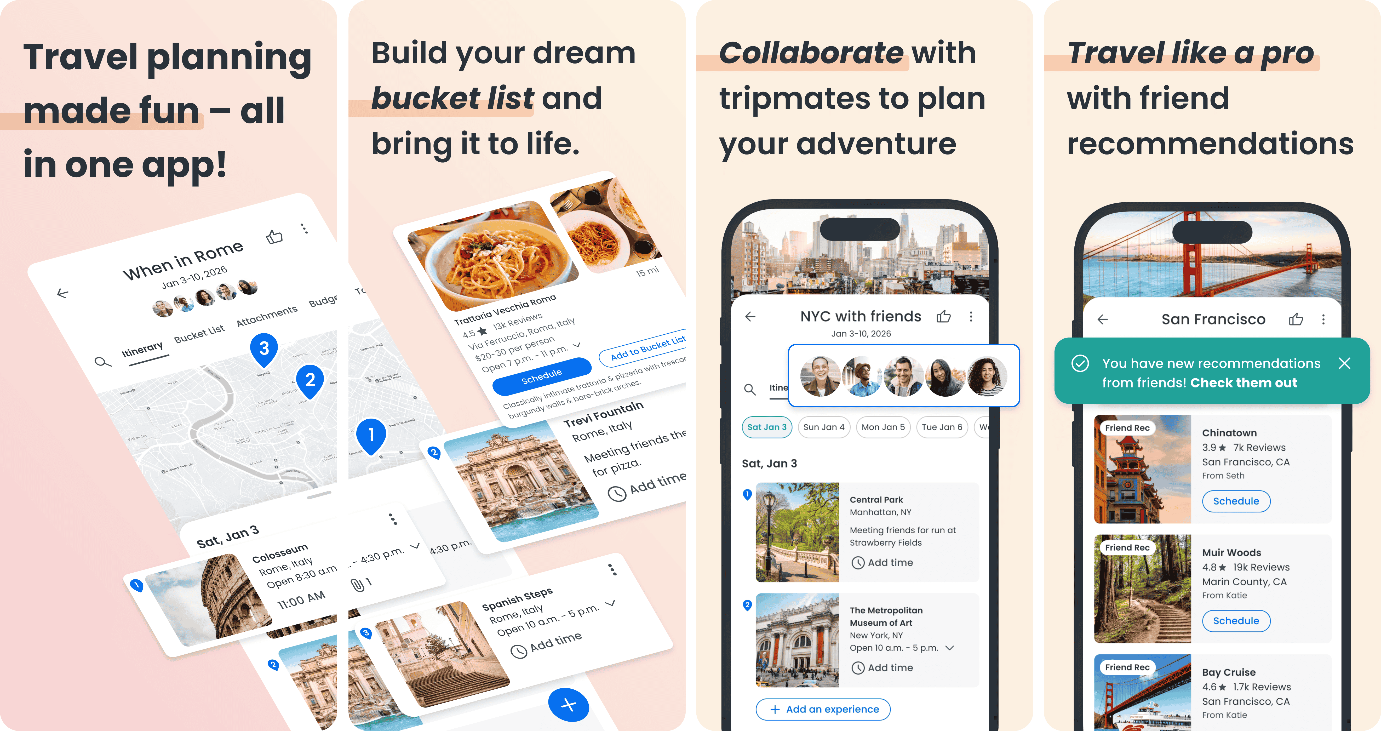
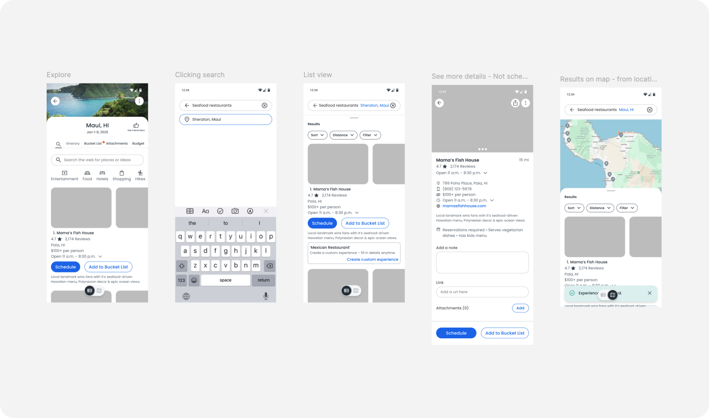
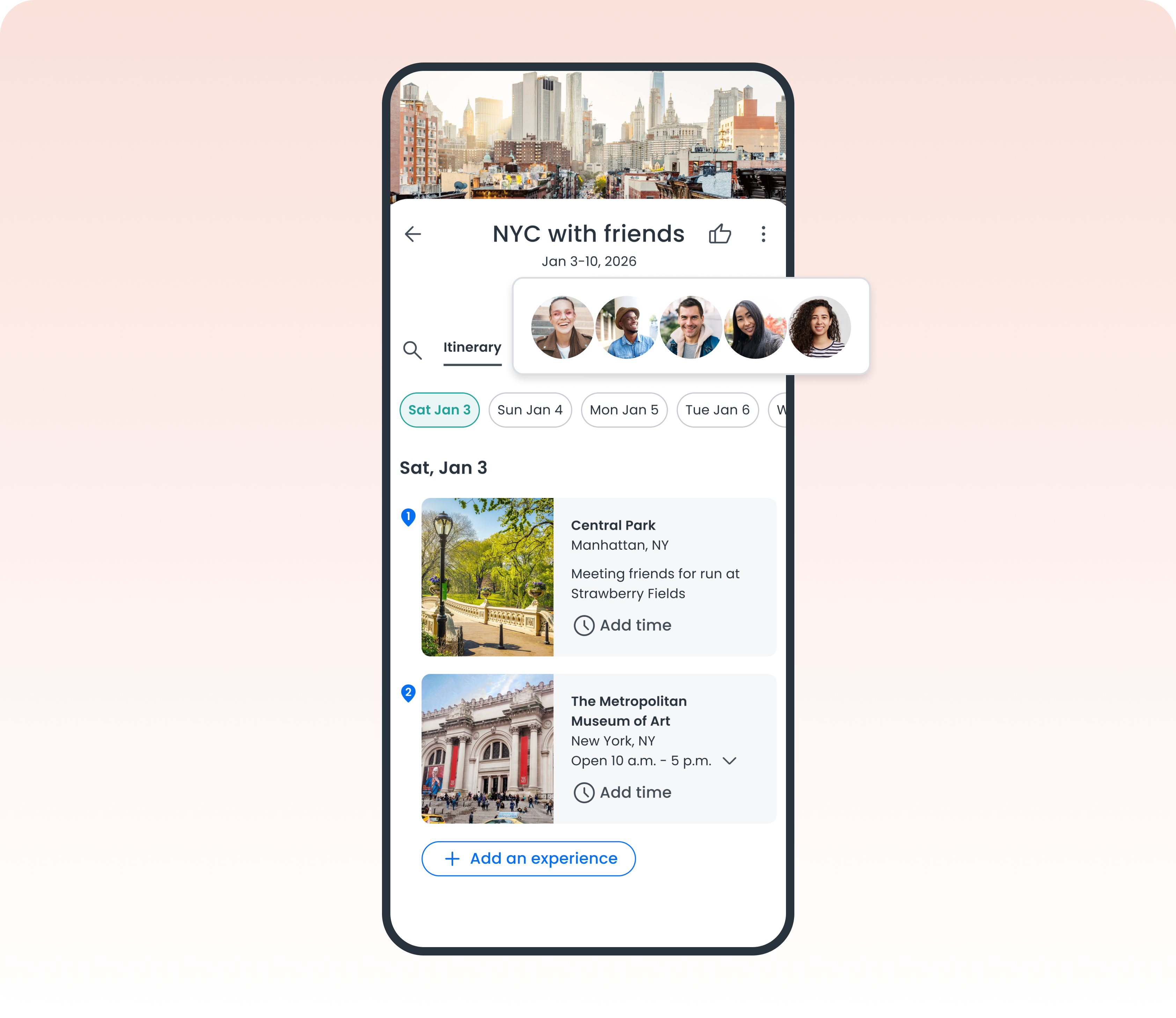
The Solution
Once the experience had been validated through research and stakeholder reviews, I translated the product into high-fidelity mobile designs. The final experience centered around a collaborative trip workspace where groups could move naturally from inspiration to execution.
Shared Planning Workspace
Users could collect destinations, restaurants, activities, and recommendations into a single shared trip instead of scattering ideas across multiple apps.
Flexible Itinerary Planning
Trips could be organized visually while still allowing users to freely brainstorm before assigning activities to specific days.
Real-Time Collaboration
Friends could join trips, contribute ideas, comment, and collaborate together throughout the planning process.
Map-Based Discovery
Activities could be viewed geographically, helping users organize plans around proximity instead of manually jumping between mapping apps.
Everything in One Place
Budgets, attachments, notes, and trip details lived alongside the itinerary, eliminating the need to switch between multiple tools.
Launch & Ownership
Beyond product design, I owned many aspects of bringing the product to market.
My responsibilities included:
- Leading discovery workshops
- Facilitating stakeholder alignment
- Defining MVP scope
- Conducting user interviews
- Synthesizing research findings
- Creating user flows
- Designing low- and high-fidelity wireframes
- Building interactive prototypes
- Designing the visual interface
- Creating App Store assets
- Designing the marketing landing page
- Supporting launch on both iOS and Android
The product successfully launched in both app stores and currently maintains a 5.0-star rating, validating many of the assumptions we tested throughout the design process.
Reflection
This project reinforced the importance of validating product ideas before investing in polished designs.
Some of our biggest improvements came from testing simple wireframes, where users revealed behaviors we hadn't anticipated—like separating brainstorming from itinerary planning and organizing experiences by proximity.
It also reinforced that successful collaboration isn't about adding more features. It's about reducing friction, creating shared understanding, and designing workflows that feel natural for groups making decisions together.