Designing a sales-first product discovery experience for a lighting manufacturer
Sales representatives relied on the company's website as their primary selling tool, but slow performance, poor search, and limited organization made it difficult to help customers compare products and make decisions. I redesigned the experience around fast product discovery, flexible organization, and collaborative selling.
Overview
Role
Lead Product Designer (sole designer)
Duration
Several months across multiple product sprints
Team
Product Owner, Engineering Team, Client Stakeholders
My Responsibilities
User research, information architecture, UX strategy, UX/UI design, prototyping, developer collaboration
Outcome
Redesigned the product discovery experience, helping sales teams find products faster, organize client projects, compare fixtures, and create presentations directly from the platform.
The Problem
The website wasn't just slow—it interrupted the sales process.
Sales representatives used the website alongside customers every day to browse products, answer questions, and build recommendations. Instead of helping those conversations, the experience created friction. Products were difficult to find, filtering was limited, imagery made it hard to evaluate fixtures, and slow performance interrupted the flow of client meetings.
The challenge wasn't simply improving an eCommerce site. It was designing a tool that sales professionals could confidently use in front of customers.
Understanding Users
Through stakeholder conversations and workflow mapping, one thing became clear. Sales representatives weren't shopping for themselves. They were actively guiding customers through purchasing decisions. Three behaviors consistently shaped the redesign.
Finding products needed to be fast.
Sales conversations move quickly. Representatives needed to narrow thousands of fixtures into a handful of relevant options within seconds.
Organization mattered as much as search.
Every salesperson managed multiple builders, designers, and homeowners simultaneously. They needed a way to organize products into reusable client collections rather than maintaining scattered notes and bookmarks.
Comparison drives confidence.
Customers rarely selected the first fixture they saw. They wanted to compare finishes, dimensions, styles, pricing, and availability before making a decision. The website didn't support that process.
My Role
As the sole Product Designer, I led the redesign from discovery through delivery. Working closely with stakeholders and Engineering, I restructured the site's information architecture, redesigned core shopping workflows, and introduced new organizational tools that better supported how sales representatives actually worked with customers. Rather than designing individual pages, I focused on creating an experience that accelerated product discovery and made client conversations more productive.
Key Decision #1
Redesign search around how people actually shop
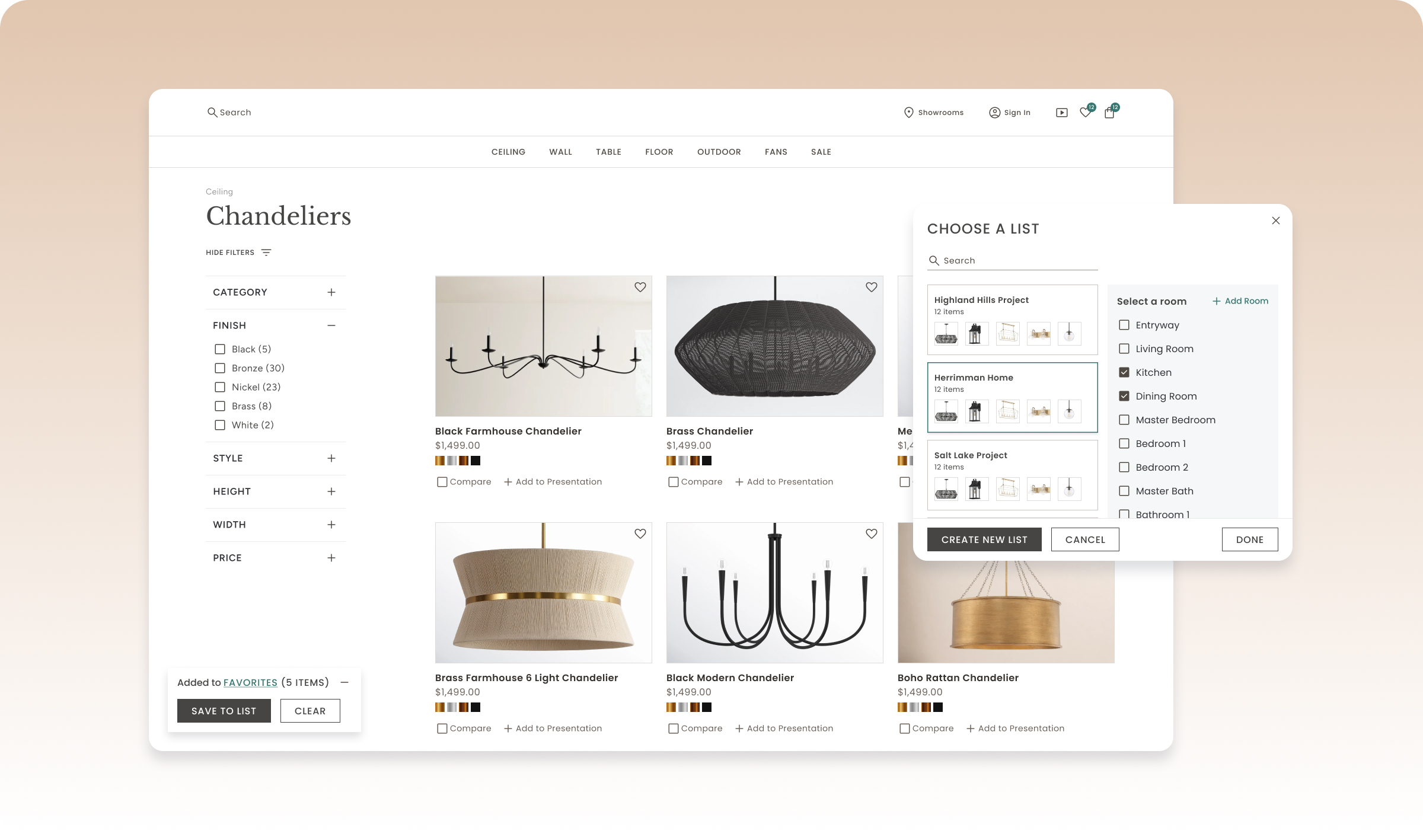
The original navigation made it difficult to browse a large product catalog. I reorganized the information architecture and introduced powerful filtering and sorting tools that allowed users to quickly narrow products based on style, finish, room, dimensions, availability, and other attributes. Instead of searching through hundreds of products, users could quickly surface the few that matched their client's needs.
Key Decision #2
Turn saved products into client workspaces
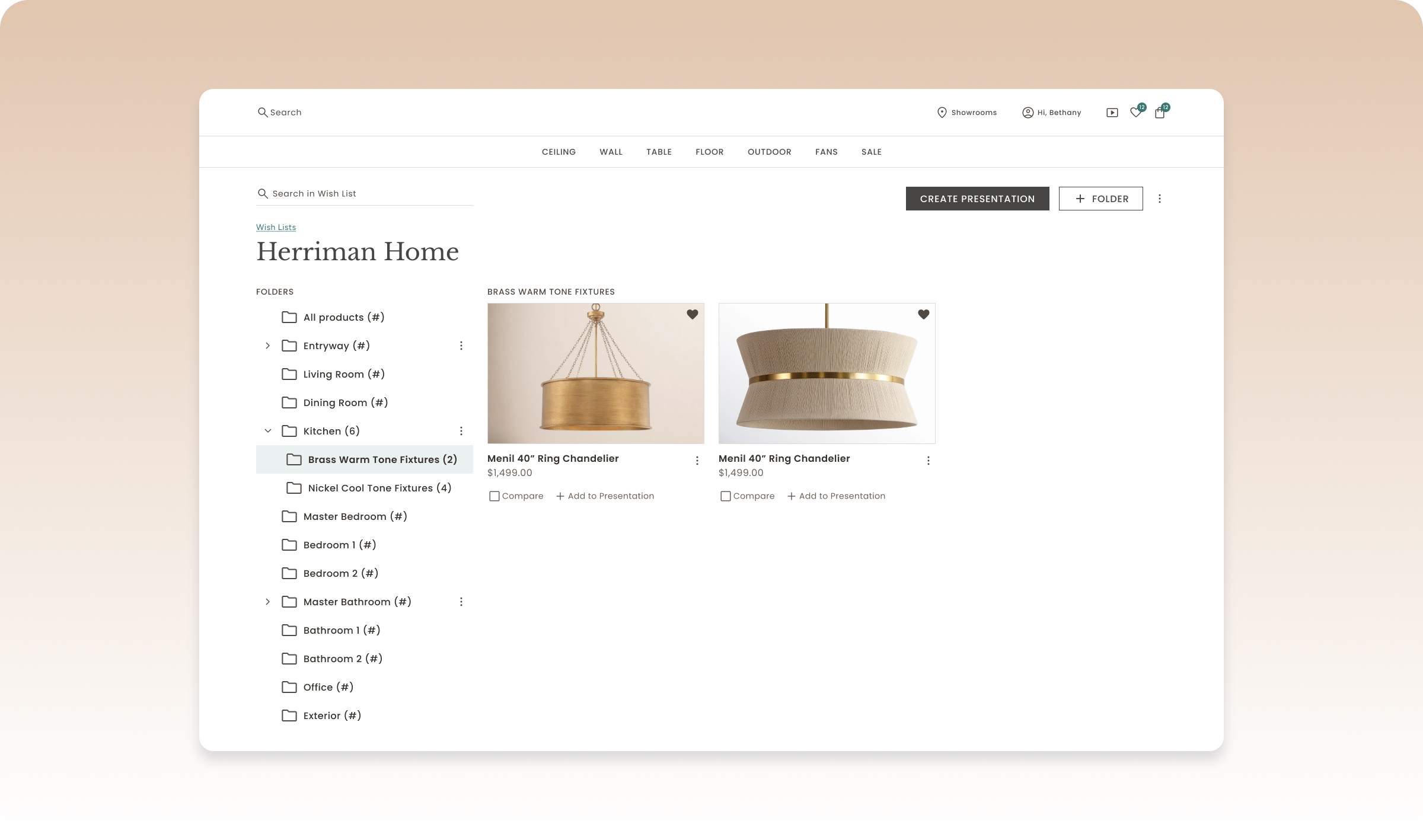
Sales representatives weren't simply saving favorites. They were managing dozens of active client projects. I designed a flexible organizational system that allowed users to save products into folders and nested collections, making it easy to organize recommendations by client, home, or individual room. This transformed saved items into an active sales tool instead of a simple wishlist.
Key Decision #3
Help customers compare options without leaving the conversation
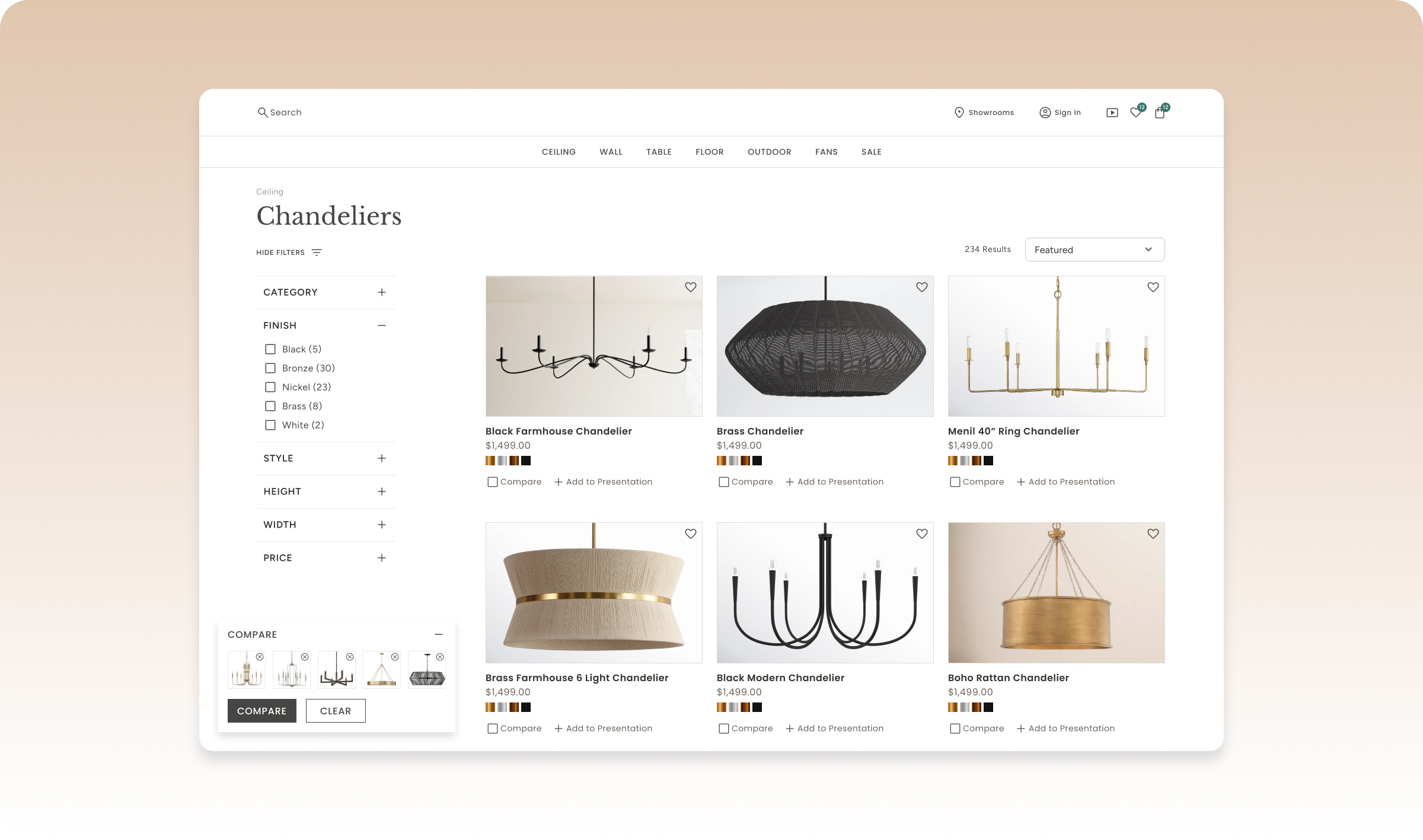
Choosing lighting fixtures often requires comparing subtle differences across several products. I designed a side-by-side comparison experience that allowed sales representatives and customers to evaluate specifications, finishes, dimensions, availability, and pricing without constantly navigating between product pages. This made decision-making faster while keeping conversations focused.
Key Decision #4
Extend the experience beyond the website
Sales representatives regularly shared recommendations with builders, designers, and homeowners after meetings. Rather than asking users to recreate selections elsewhere, I designed a workflow that allowed organized product collections to be transformed into polished presentations that could be shared directly with clients. The website became more than a catalog—it became an extension of the sales process.
Final Solution
A product discovery experience built for collaborative selling
The redesigned platform helped sales representatives move seamlessly from product discovery to organization, comparison, and presentation. Users could quickly filter thousands of products, organize recommendations for multiple clients, compare fixtures side by side, and share curated presentations—all within a single workflow.
Powerful Product Discovery
Advanced filters and intuitive navigation help users quickly narrow thousands of fixtures into relevant options.
Client Collections
Nested folders allow sales representatives to organize recommendations by client, project, home, or room.
Product Comparison
Side-by-side comparisons make it easy to evaluate finishes, dimensions, specifications, and availability during live client conversations.
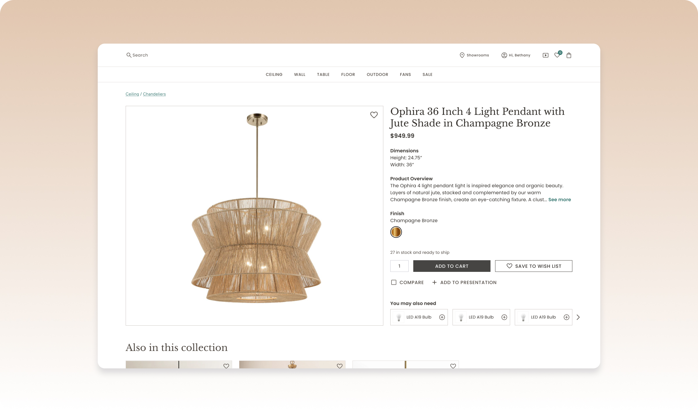
Product Details
A redesigned product page highlights the information users need most—including inventory, dimensions, compatible bulbs, coordinated fixtures, and related collections—making it easier to answer customer questions without leaving the page.