
Designing a Travel Document Portal for First-Time International Travelers
Overview
Missionaries assigned to serve internationally needed to complete passports, visas, vaccinations, and other country-specific travel requirements before departure. The process involved multiple stakeholders, varying requirements depending on destination, and numerous approval steps before a traveler could leave. Most users were 18–20 years old and traveling internationally for the first time. Many felt overwhelmed by the process, overlooked important instructions, or relied on parents to complete tasks on their behalf.
As the sole Product Designer, I partnered closely with product owners and stakeholders to transform a fragmented, manual workflow into a guided digital experience that made complex travel preparation understandable and transparent.
Understanding the Problem
Before designing interfaces, I needed to understand how the existing process actually worked. At the time, travel preparation was managed almost entirely through spreadsheets, emails, and manual coordination between multiple internal teams.
There was no centralized experience for users to understand:
- What documents they needed
- Which tasks were still outstanding
- Who was currently working on their application
- How close they were to receiving travel approval
This lack of visibility created confusion for travelers and generated a significant amount of support requests from both missionaries and their parents.
Rather than simply digitizing the existing workflow, our goal was to simplify it. I worked with stakeholders to map the current process, identify pain points, understand where automation could replace manual work, and determine which information users actually needed throughout their journey.
The Design Challenge
The complexity extended far beyond displaying a checklist. Every traveler had a unique experience depending on:
- Their assigned country
- Required travel documents
- Vaccination requirements
- Internal review processes
- Multiple documents progressing simultaneously
In addition, several people could participate in the process, including missionaries, parents, and local leaders, each requiring different permissions and levels of visibility. The experience also needed to comply with strict organizational branding and accessibility standards. Every component, interaction, and visual treatment required approval before implementation. The challenge became designing a system that could support hundreds of possible travel scenarios while still feeling simple for first-time international travelers.
Designing the Experience
After understanding the operational workflow, I focused on reducing uncertainty at every step of the experience. Rather than overwhelming users with paperwork and instructions, the portal guided them through one task at a time.
Personalized Task Management
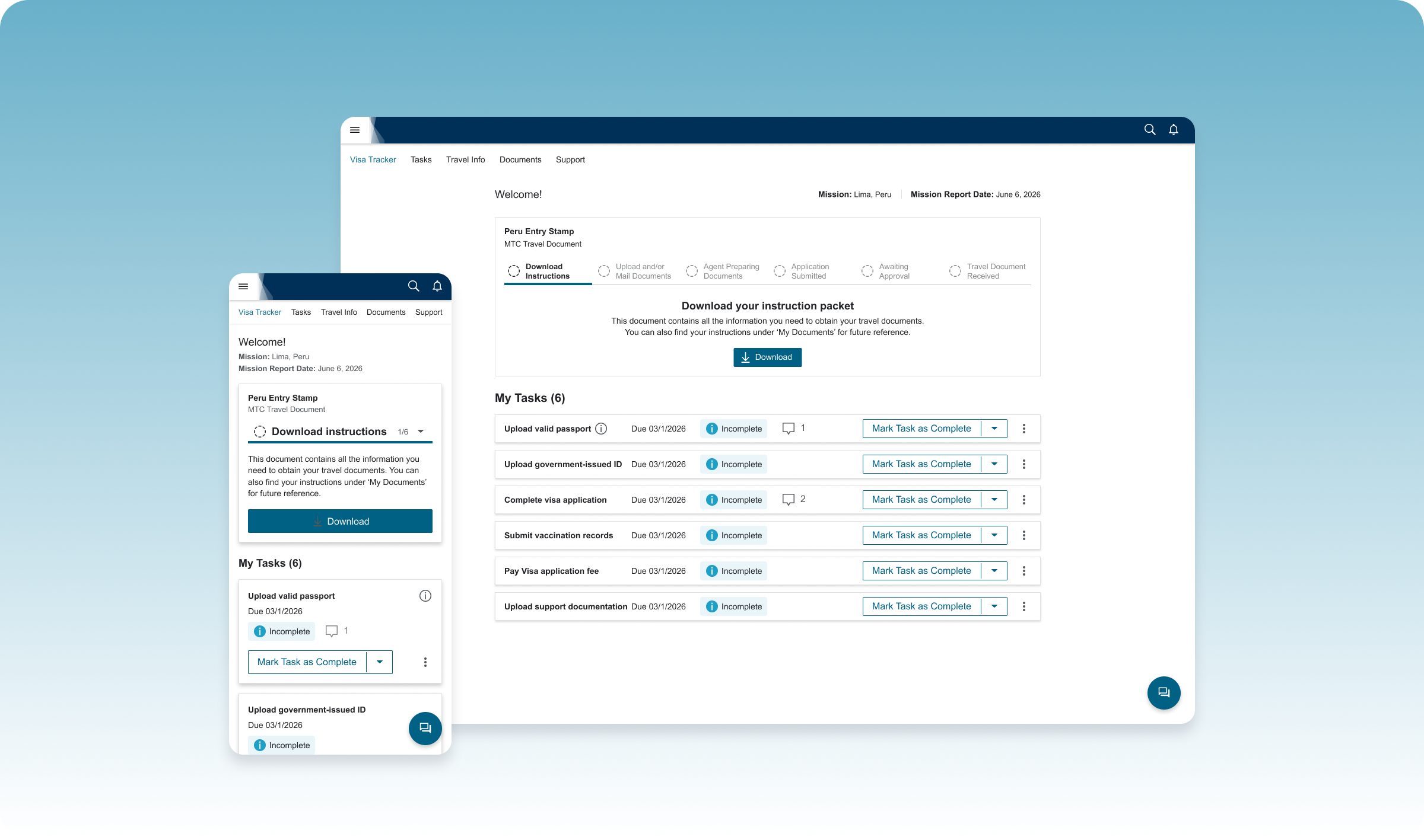
Using data from existing internal systems, the portal automatically generated each user's required tasks based on their assignment and destination. Instead of reading lengthy instruction emails, users were presented with a personalized checklist that clearly communicated what needed to be completed next.
Transparent Progress Tracking
One of the biggest pain points was not knowing where an application stood. To solve this, I designed a visual progress tracker—internally nicknamed the "Pizza Tracker"—that showed users exactly where they were in the travel document process. Rather than wondering whether someone had received their paperwork, users could immediately see whether documents had been submitted, were under review, required additional action, or had been approved. This small interaction dramatically improved confidence because users understood that progress was still being made, even while waiting.
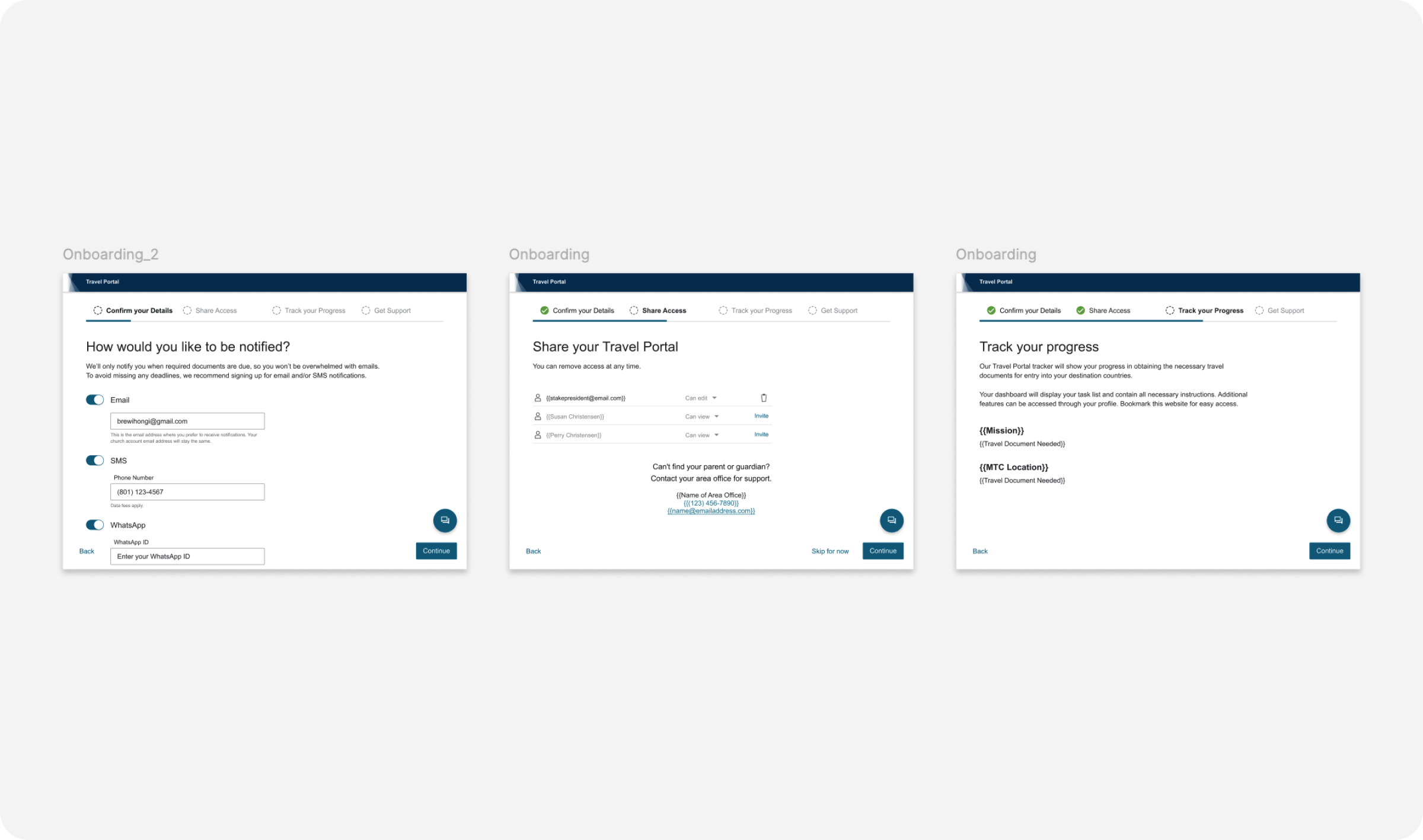
Role-Based Access
Since parents and leaders often helped complete portions of the process, I designed role-based permissions that allowed users to securely share access without exposing unnecessary information. Each role received only the functionality relevant to their responsibilities.
Simplifying Complexity
Although the backend workflow contained dozens of exceptions and country-specific variations, the front-end experience remained intentionally simple. Every design decision prioritized clarity, reassurance, and helping first-time travelers focus only on the next action they needed to take.
Outcome
The Travel Portal replaced a fragmented manual process with a centralized digital experience that guided users from assignment through travel approval.
Users could:
- Complete personalized travel tasks
- Upload required documentation
- Track application progress in real time
- Understand who was currently reviewing their documents
- Share access with parents or leaders when needed
By increasing transparency throughout the process, the portal reduced uncertainty and helped users feel more confident navigating an otherwise stressful experience.

Phase Two: Supporting Travelers Beyond Approval
Following launch, the product expanded beyond document preparation to support travelers throughout their journey.
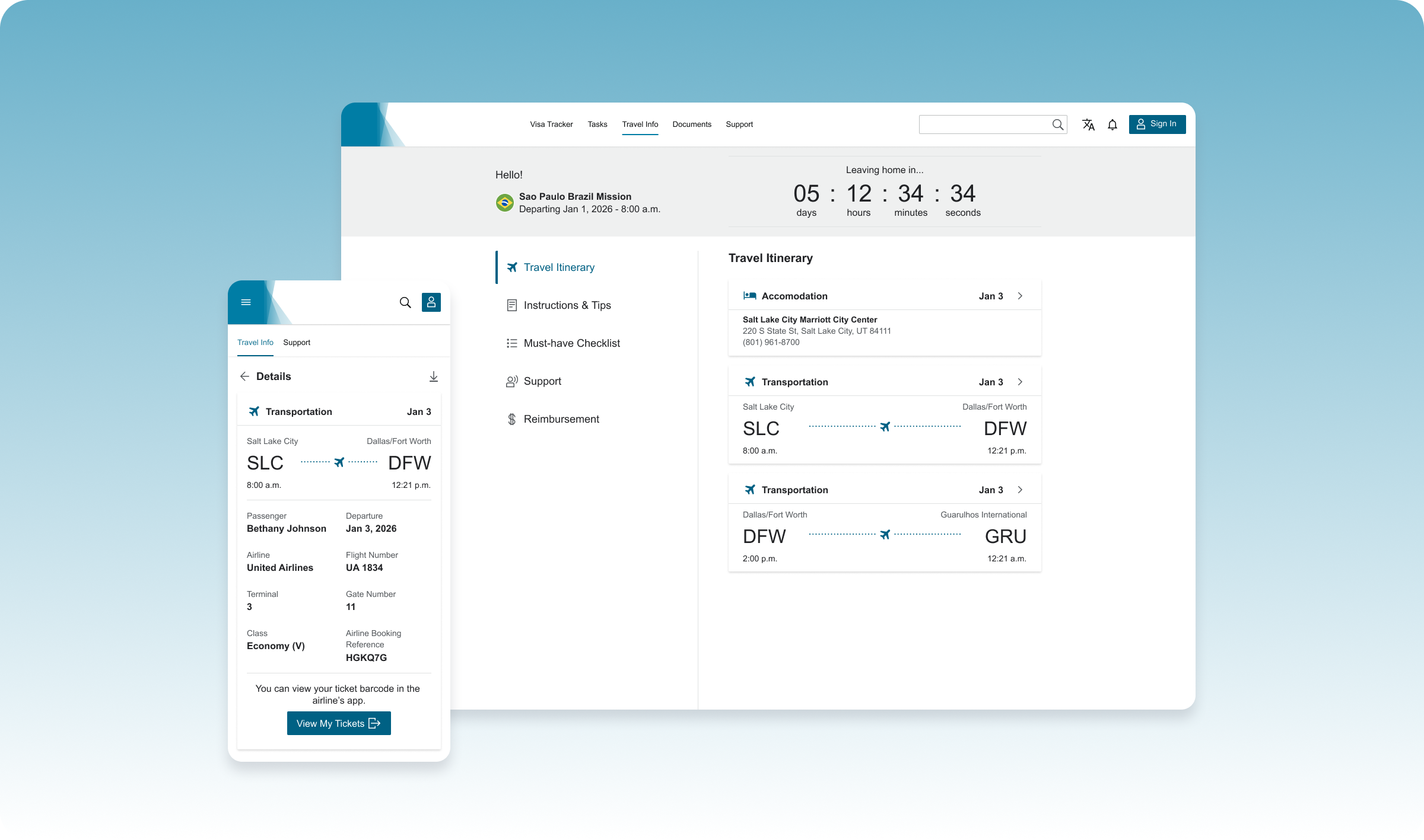
I designed a second phase that provided travelers with everything they needed after approval, including:
- Flight itineraries
- Accommodation information
- Travel schedules
- Country-specific guidance
- Packing checklists
- Arrival instructions
This transformed the portal from a document management tool into a companion for the entire travel experience.
Reflection
This project reinforced that great UX often means simplifying operational complexity rather than adding new functionality.
The real challenge wasn't designing forms or dashboards—it was understanding a complicated service involving multiple stakeholders, countless exceptions, and manual processes, then translating that complexity into an experience that felt approachable for first-time international travelers.
It also strengthened my ability to collaborate with stakeholders, map complex workflows, design within strict organizational constraints, and create systems that reduce uncertainty through clear communication and thoughtful interaction design.