
Every year, small business owners hand their accountant a full picture of their finances: income, expenses, payroll, entity details. At 1-800Accountant, that happens through the Virtual Tax Organizer (VTO), a required step for all 100,000+ business clients before any return can be filed. I redesigned it.
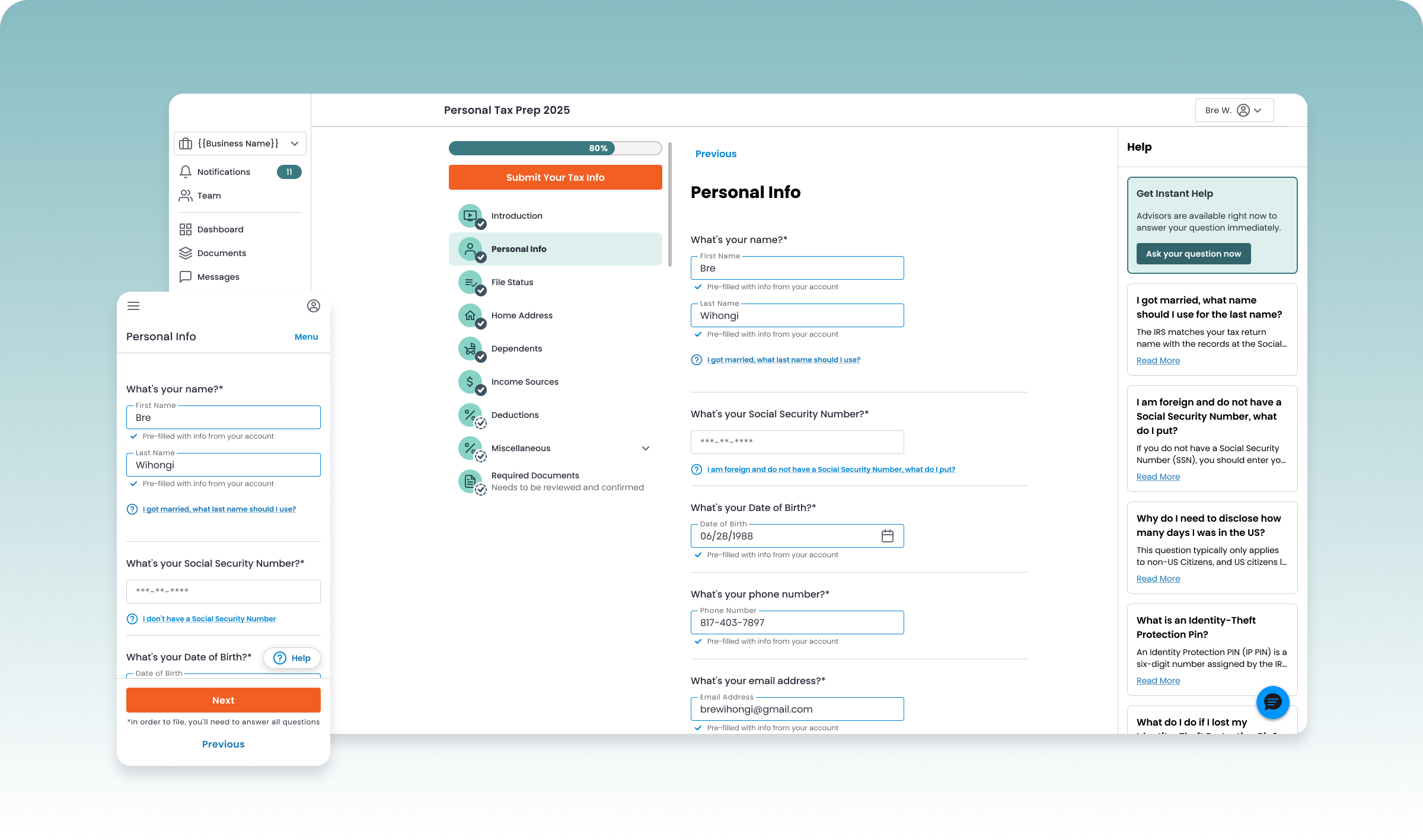
Completing the VTO meant working through a long, dense set of financial questions with unfamiliar terms and no sense of progress. For business owners already dreading tax season, that's a workflow people start and abandon. And since this data feeds directly into a real tax return, it had to earn their trust, not just their patience.
Two things made it harder than a typical form redesign: the questions and categories were still being finalized by the tax team, and it needed to work equally well on desktop and mobile.
Prefill everything we already had on file, so users are confirming, not starting from a blank page.
Desktop and mobile needed to feel like the same product, built for how each is actually used.
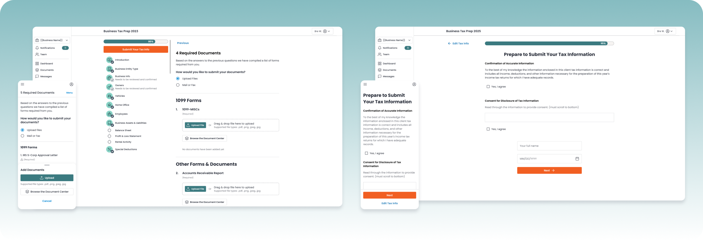
Business owners needed to attach documents from their device or their existing 1-800Accountant Business Center without hunting for files.
The question set wasn't locked when design work started, so I couldn't design screen by screen. I designed a system instead. A few other constraints shaped that system:
The tax team was still defining the exact questions and categories in parallel with design, so I couldn't design screen by screen.
LLC, S-Corp, Partnership, and more each required a different subset of questions, so the same screens had to flex without duplicating effort.
Neither could be treated as the primary experience with the other bolted on after.
Reduce effort using data we already had, but never let a user submit something they didn't actually confirm was correct.
Build reusable patterns flexible enough to absorb questions that didn't exist yet.
Desktop and mobile solve the same problem differently — both needed to feel considered, not like one was the "real" version and the other an afterthought.
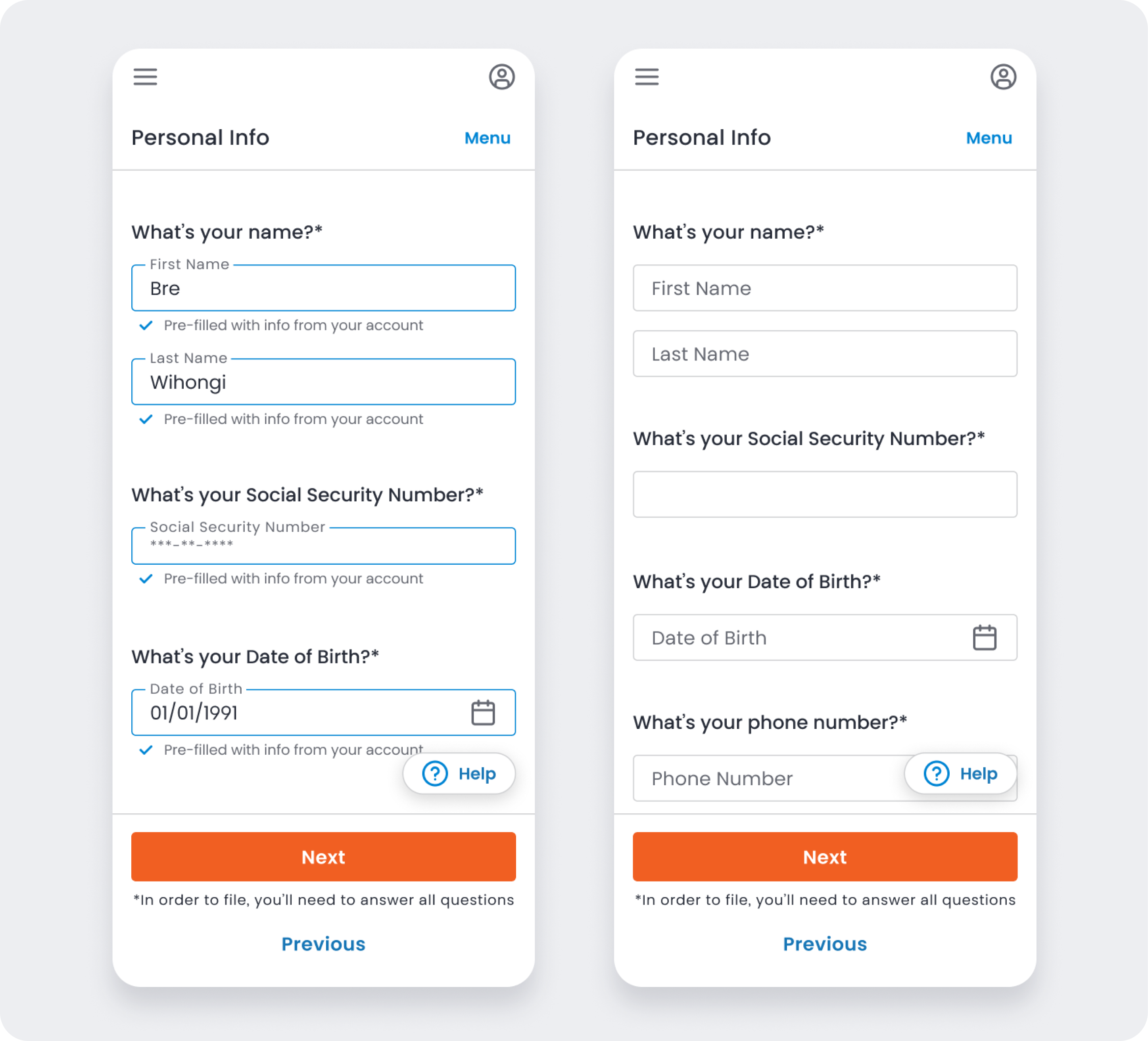
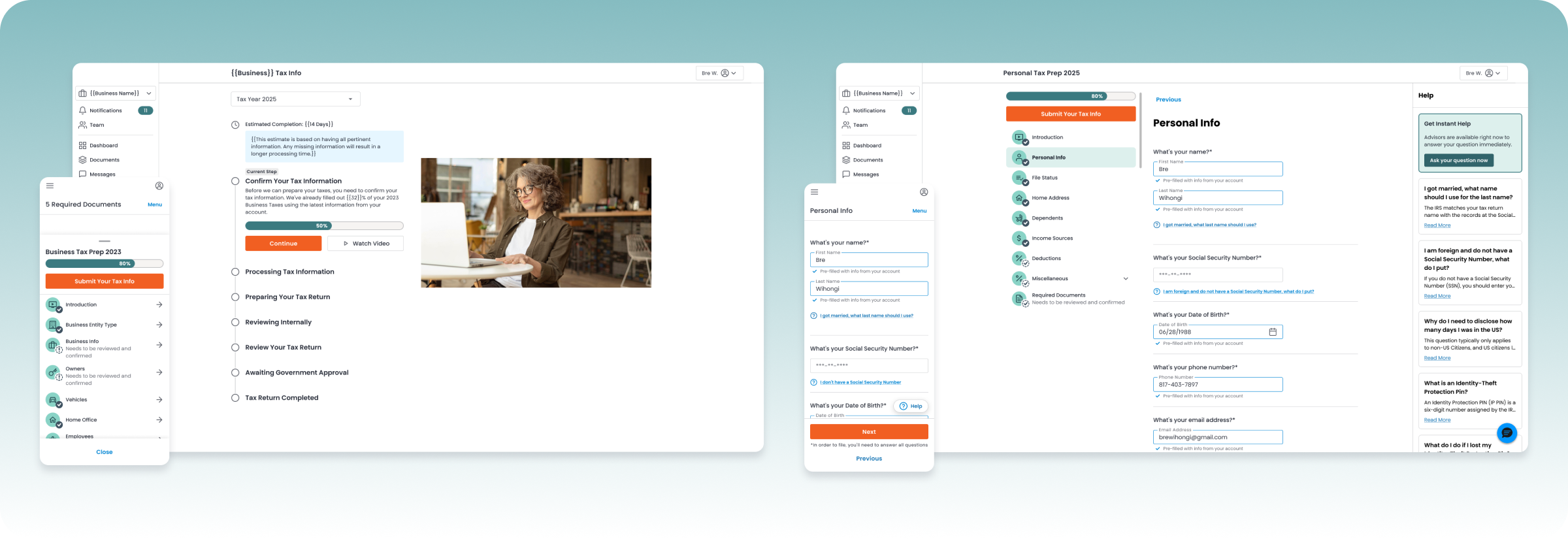
Prefilling saved people time, but it also risked hiding the fact that we'd made assumptions on their behalf. We tried several variations before settling on one: highlighting the field in our design system's info color, with a small checkmark and the label "Pre-filled with info from your account." The field stayed fully editable, so correcting a wrong prefill took no more effort than filling in a blank one. We used the same treatment on both desktop and mobile.
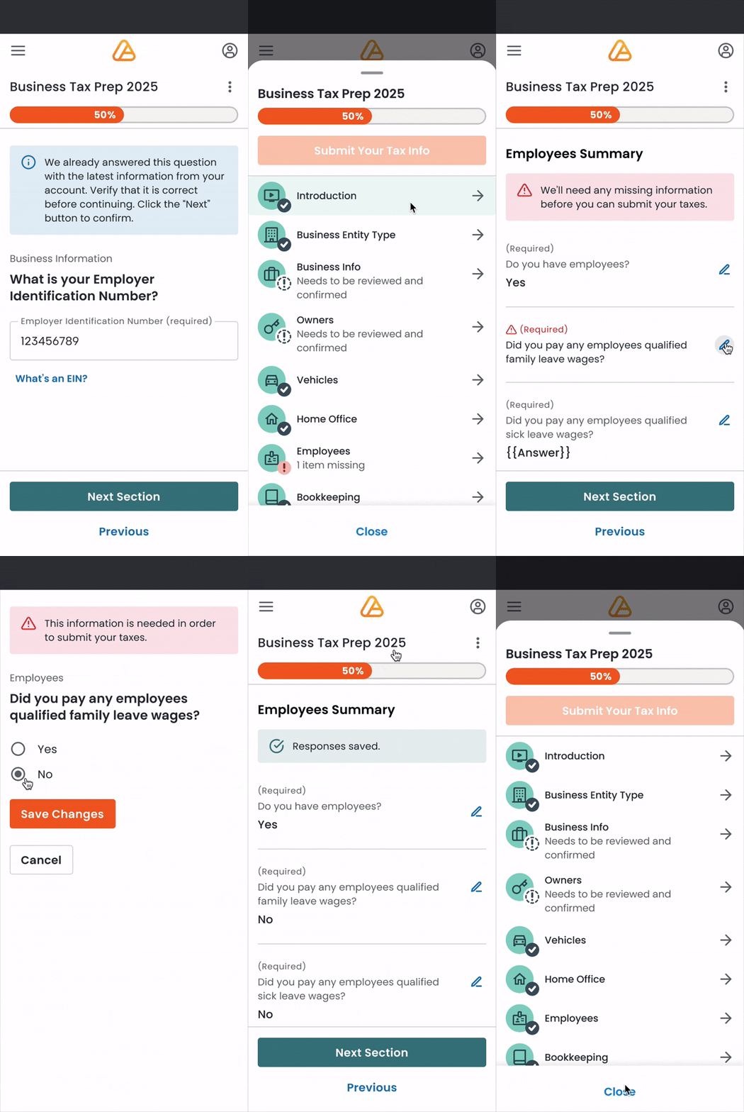
A long form is hard enough on desktop, where a sidebar shows your progress at a glance. On mobile, that context disappears, and business owners still needed to move quickly: jump ahead, go back, and know immediately if something was missing.
We explored a few directions before landing on a bottom drawer, accessible from anywhere in the flow, that gave mobile users the same awareness as the desktop sidebar in a much smaller space:
• Every section listed, so users could jump directly to it
• A visible flag on any section with missing required fields
• A progress bar showing overall completion
Without it, mobile users had no way to know if they were 10% or 90% through a long financial questionnaire, and that uncertainty is exactly what causes people to abandon a task.
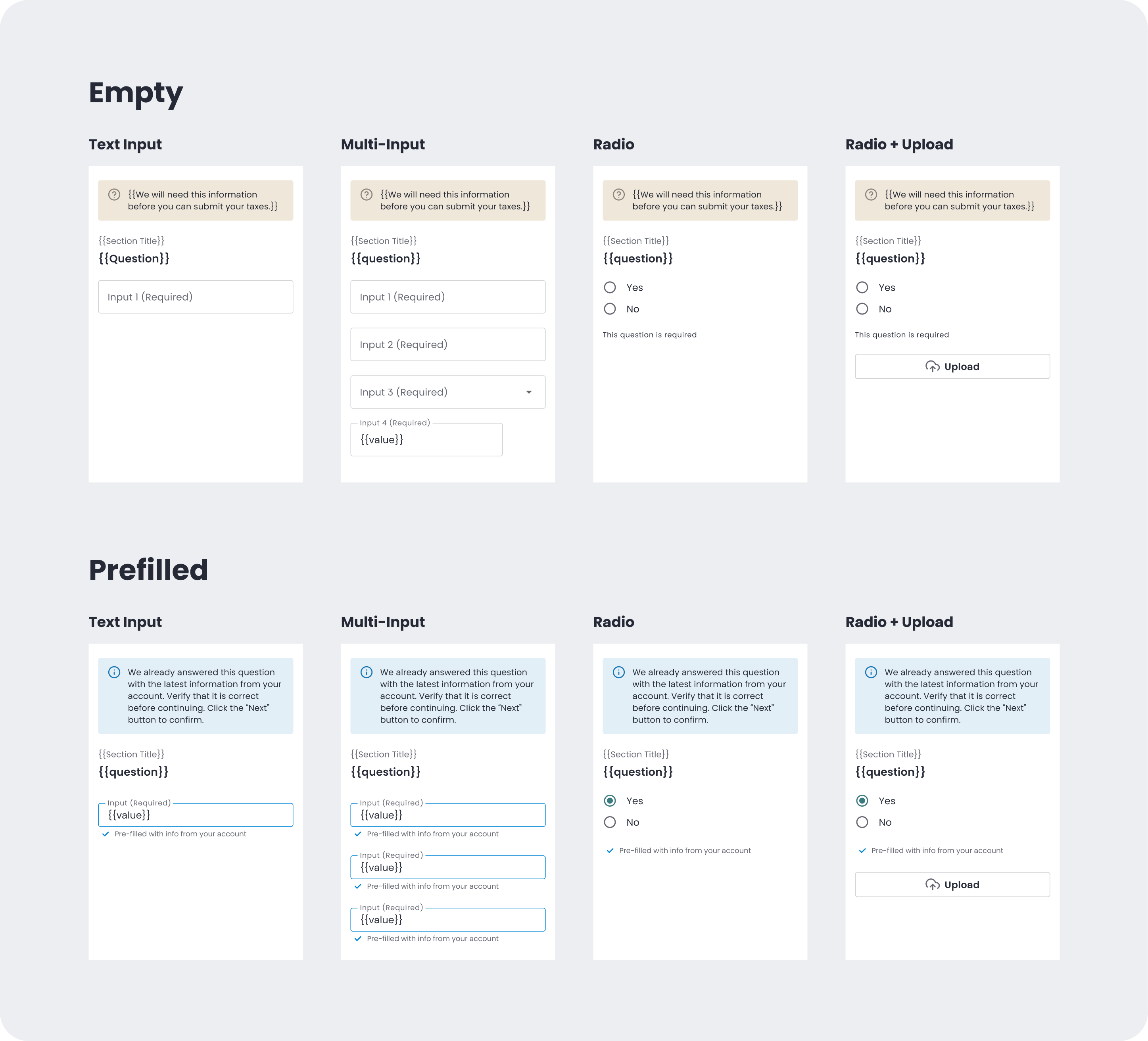
Because the tax team was still finalizing the questions, I designed the underlying system instead of a fixed sequence of screens. Every question needed to resolve into one of a few patterns: text input, dropdown, radio, or checkbox, each with defined states for empty, prefilled, valid, and error. That system is what let new questions get added later without a new round of design each time.
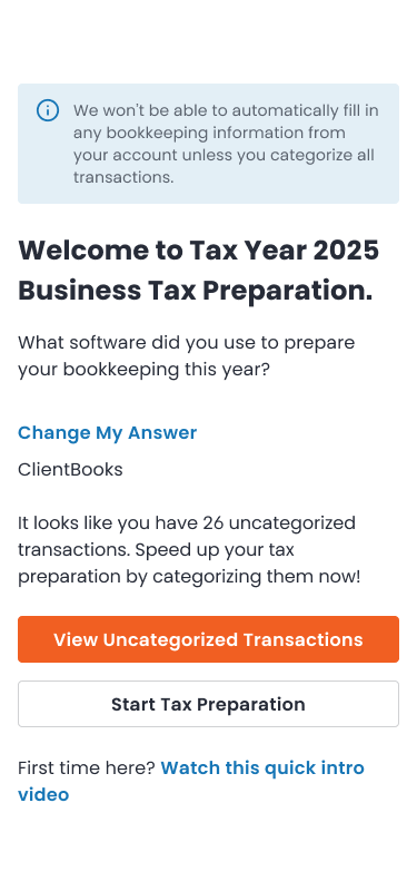
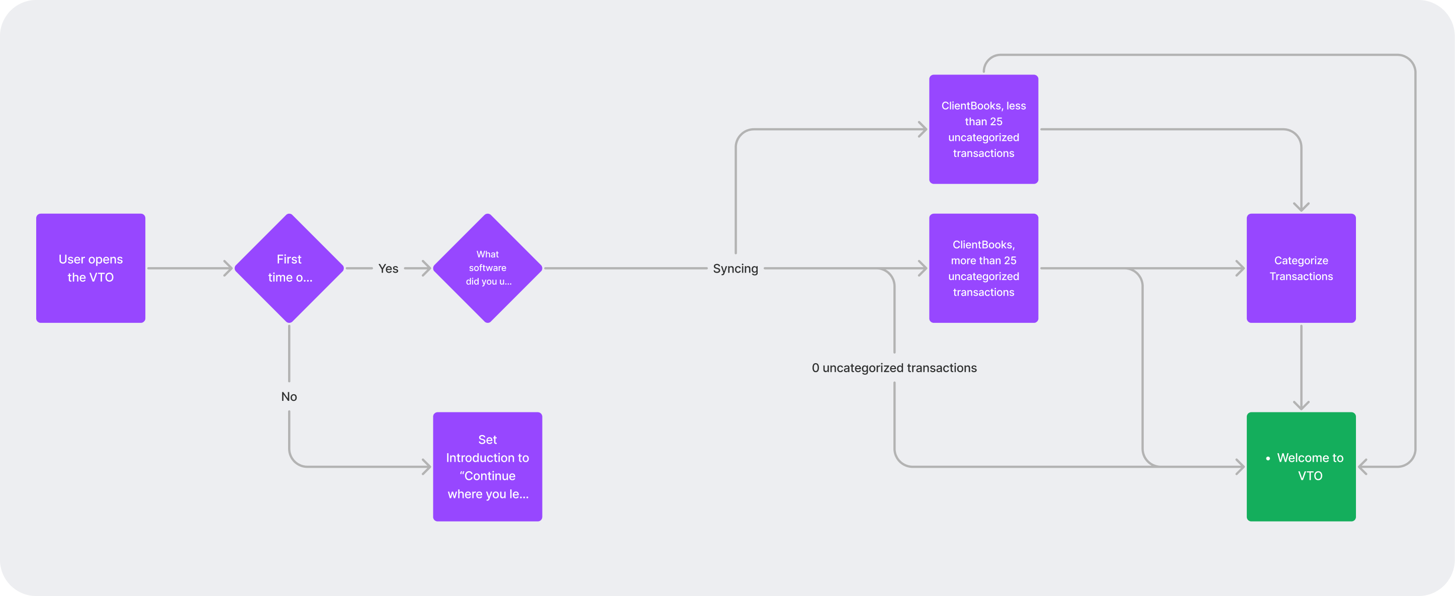
Partway through, a new dependency surfaced: the tax team couldn't calculate what a business owed until its bookkeeping was current. Business owners now needed to sync their bookkeeping before starting the VTO, a step nobody had planned for at kickoff.
We added a short flow at the front: select your bookkeeping software, connect it, and categorize any uncategorized transactions before moving into the organizer. Because the underlying question patterns were already modular, this new step slotted in without reworking what came after it.
1-800Accountant doesn't publish task-completion or drop-off metrics for the VTO specifically, but public information points to how central this workflow is to the business:
That's driven by the platform's self-service portal tools, of which the VTO, as the main data-collection workflow, is a core part.
Independent product reviews specifically call out the step-by-step clarity of the platform's onboarding and documentation flow as a strength.
1-800Accountant has stated that completing the Virtual Tax Organizer is the necessary next step before an accounting team can begin filing — this workflow sits on the critical path for every one of the platform's 100,000+ business clients.
What I'm most proud of on this project is taking something genuinely complicated (unfinalized tax questions, multiple entity types, real financial stakes) and making it feel simple enough to fill out in a spare 20 minutes. None of the individual pieces, prefilling, the mobile drawer, the question-type system, were flashy on their own. Together, they're what let a complicated process feel easy.