HR data lives in a dozen different systems, and turning it into something leadership can act on used to take days. I designed Parita's AI Report Builder and Presentation Builder: ask a question and get the right chart, then turn it into a deck with speaker notes already drafted, without losing track of what the data can and can't support.
HR business partners rebuild stakeholder decks almost daily: pulling numbers, choosing charts, writing talking points. And every time the data changes, they start over.
Parita already connected companies' scattered HR tools into one platform, so the data was there. The challenge was turning it into a story users could trust, especially when the AI was working with a partial picture and users couldn't tell.
Not a blank canvas — a draft they could shape into their own story.
Users shouldn't need to know chart theory to explain their data well.
AI could accelerate the first draft — the final story stayed theirs.
Parita sold to all kinds of businesses. Some customers would have access to their entire company's data. Others would only see a slice of it. And even within one deck, the right way to visualize a topic could shift completely depending on which filters were applied.

Some users see everything. Some see one slice. Filters had to be anticipated, not assumed.

Some filter combinations call for a bar chart. Others need a funnel chart to tell the same story clearly.

A chart alone doesn't tell an executive anything. Someone still had to write what it meant.
Every decision came back to these three principles.
We mapped what data each type of client would realistically have, and proactively decided which filters to surface for them.
The chart type follows the topic and filters — not the other way around. The visualization should explain the data, not decorate it.
Every chart, every note, every slide AI created stayed fully editable. Speed never came at the cost of control.
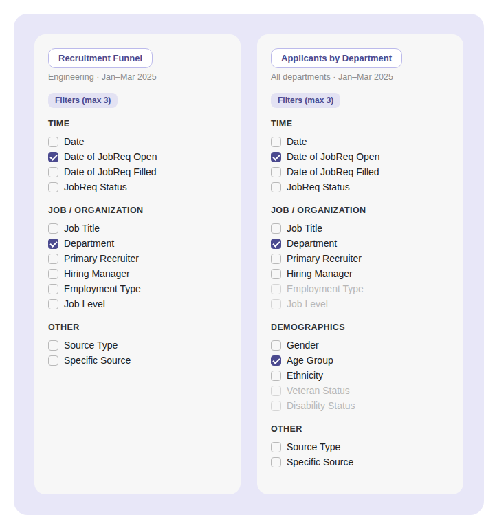
Parita connects to each client's HR systems over API, so we never knew what data a given company would have — some grant full access, others only a slice — and different topics, like time-to-hire versus attrition, need different lenses. Instead of a bespoke filter panel per client or topic, we built one taxonomy — Time, Job/Organization, Demographics, Other — reused everywhere. What changes is which filters surface, whether a category appears at all, and what's available versus grayed out. We stayed generous rather than minimal, capped at three active filters so that generosity didn't turn into clutter.
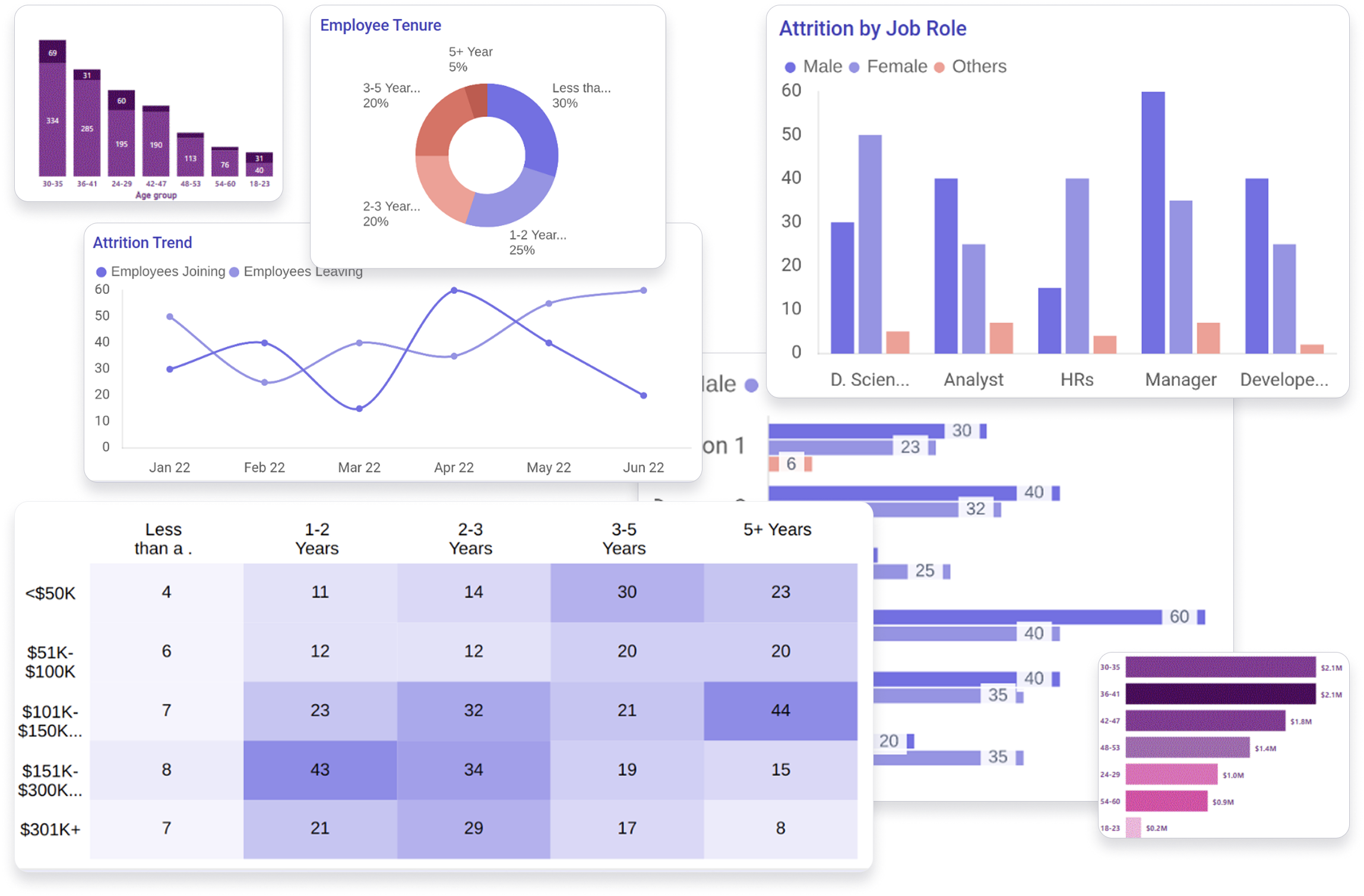
The AI selects each chart, but "pick a good chart" isn't something a model gets right on its own. The right chart depends on what's being compared, not just the topic. Attrition across departments is a bar chart. Attrition in one department over time is a line. Candidates moving through hiring stages is a funnel.
Halfway through the project, I built a set of low-fidelity examples that paired topics and filter combinations with the chart that should come out: if the topic is attrition and the filters are these, output this. Change the filters, and it becomes this. Those examples became guidance the AI uses to choose charts.
Designing the examples, not just the screens, was the part of the work that shaped how the product actually behaves. Every chart a user sees traces back to a decision about what that combination of data means.
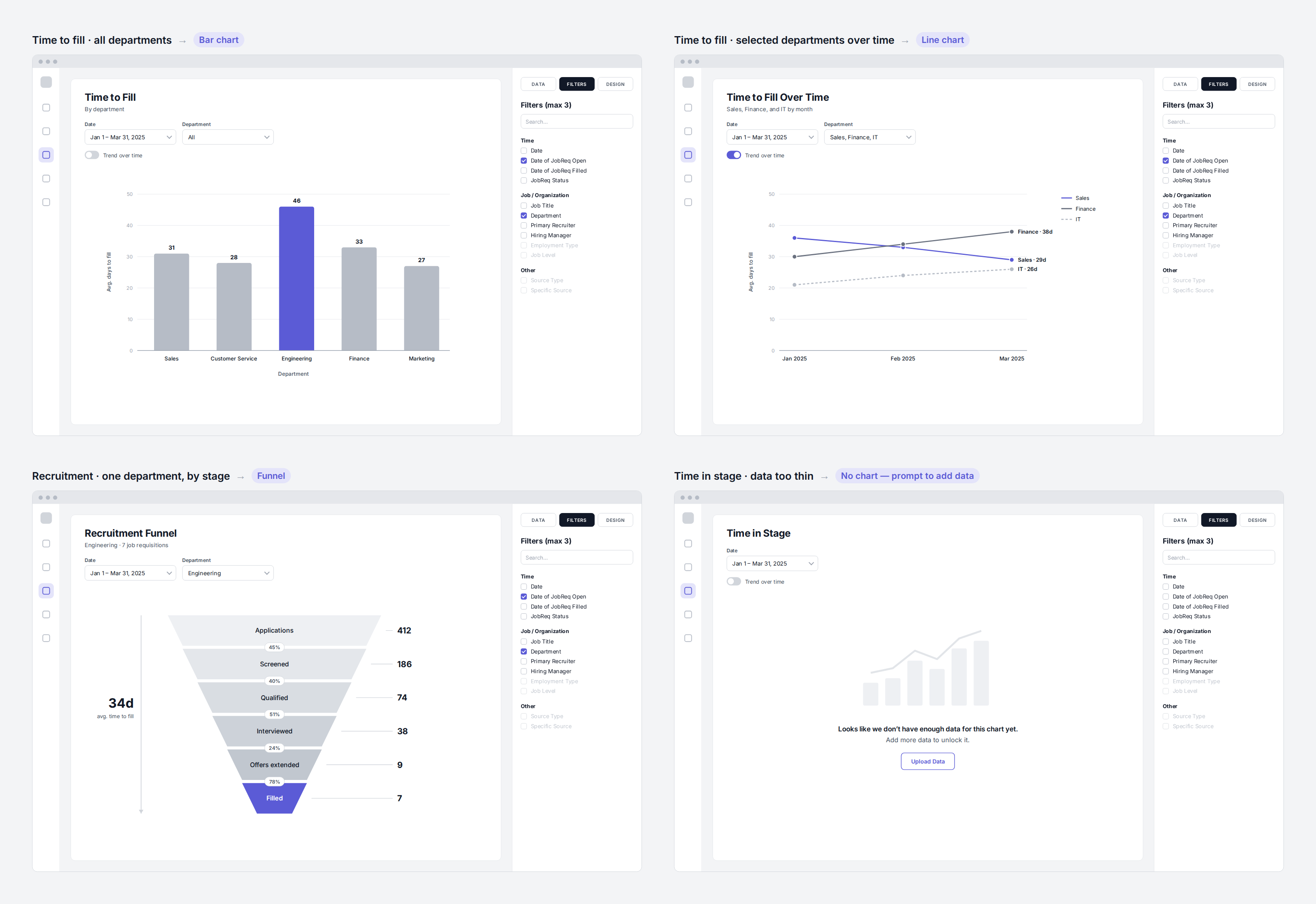
Same topic, different slice, different chart, and a message instead of a chart when the data is too thin.
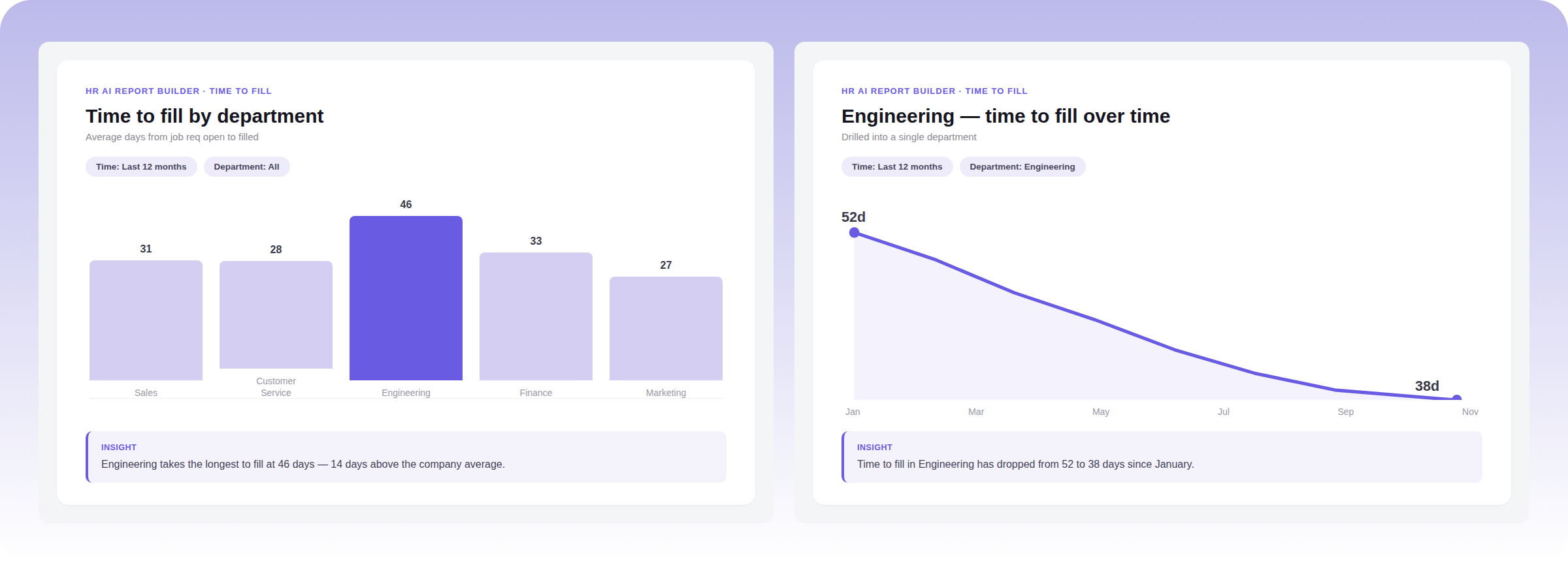
The AI compares every department with a bar chart, then switches to a line chart when you drill into Engineering over time.
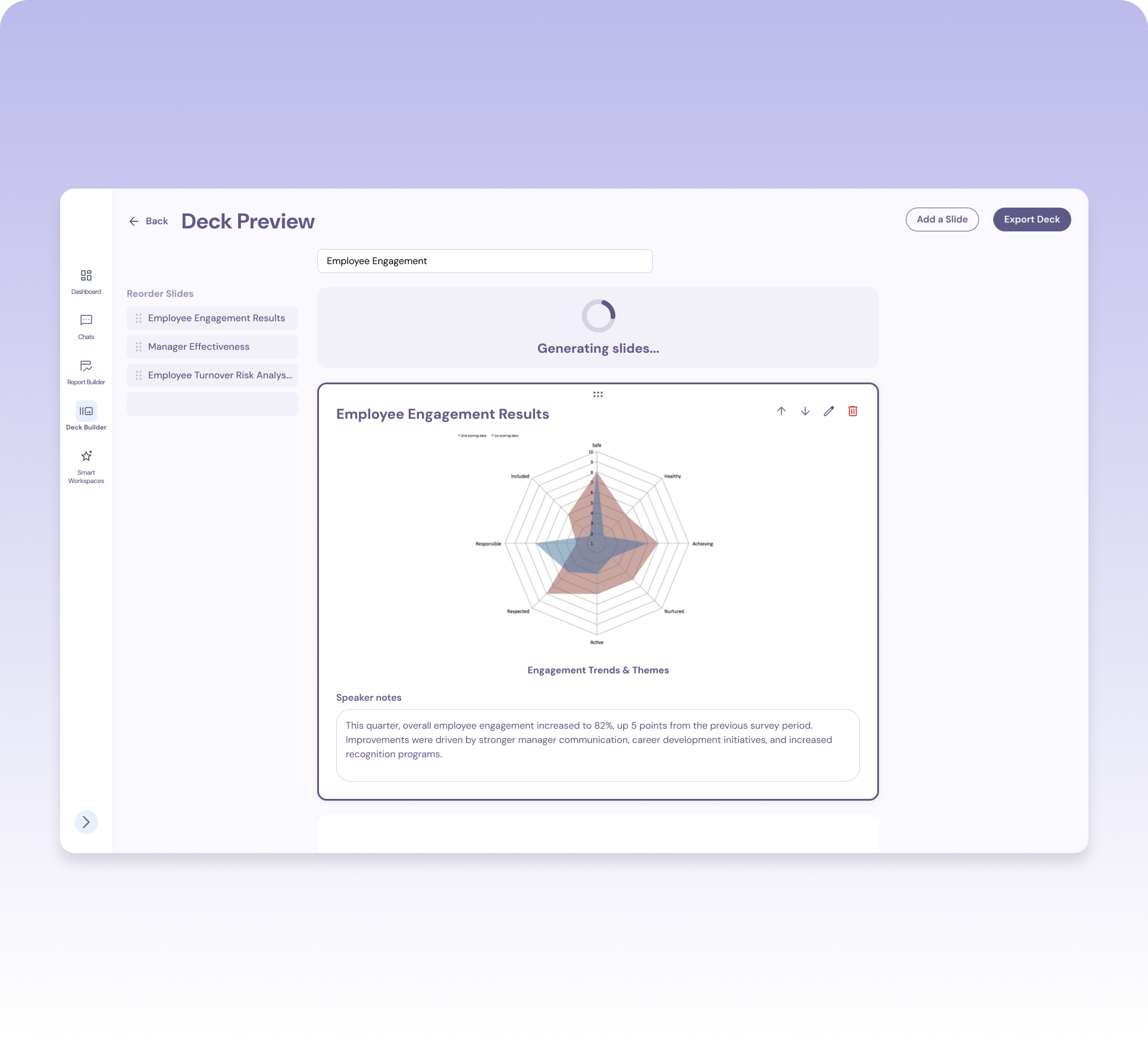
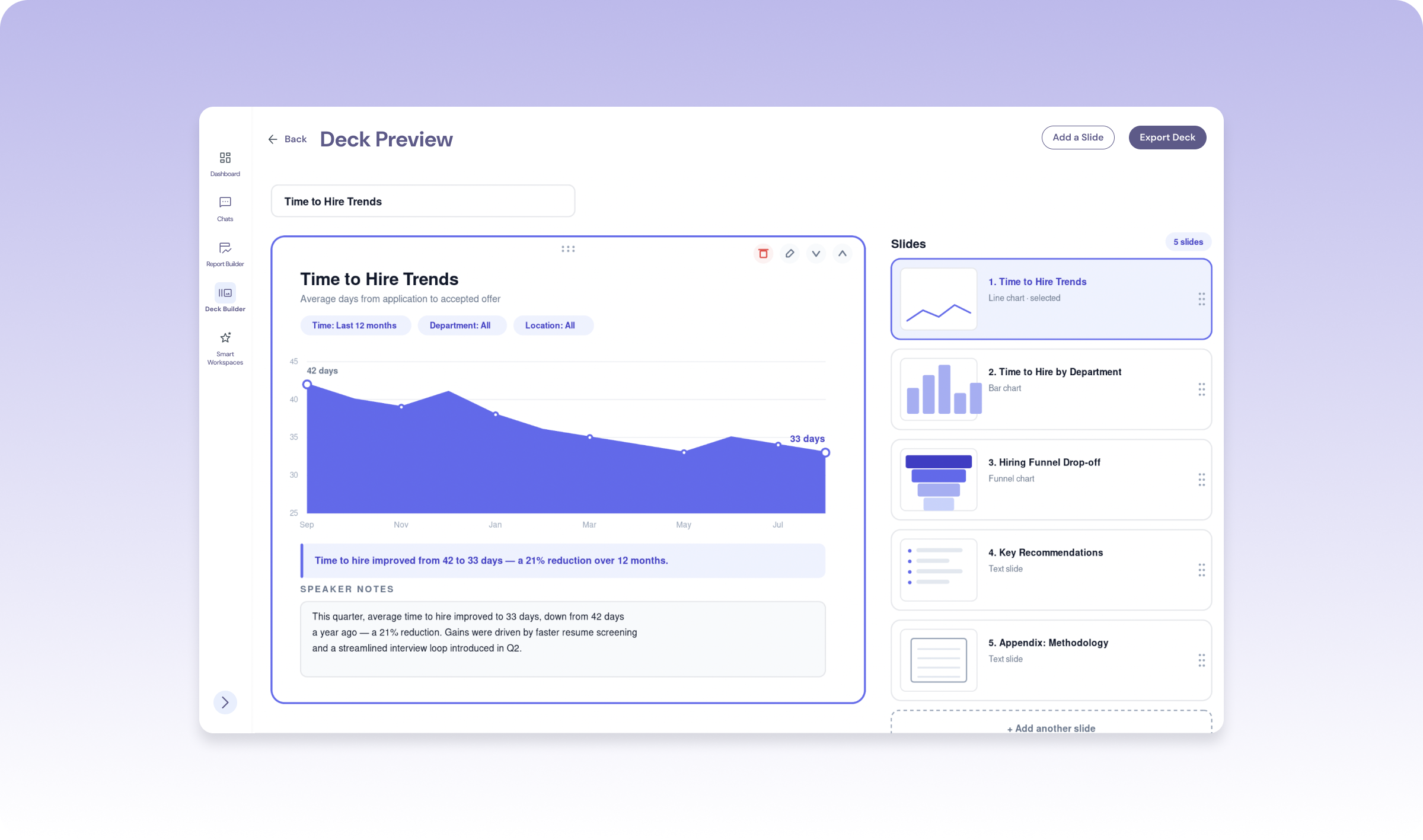
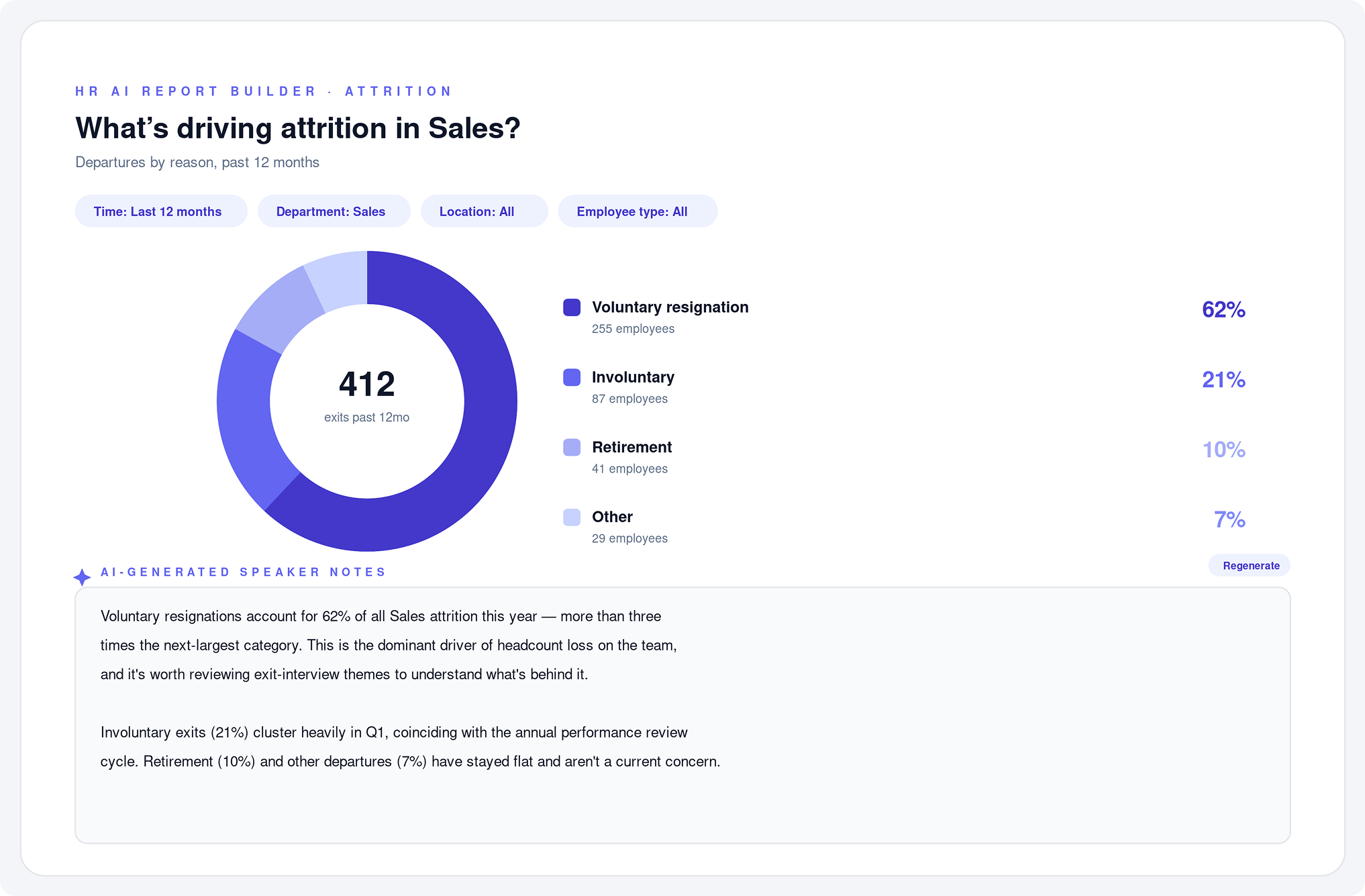
Building the charts wasn't the only time suck — users also had to write the talking points for every slide. I designed AI-generated speaker notes for each chart, giving users a starting narrative for every slide they could edit, rewrite, or approve as-is.
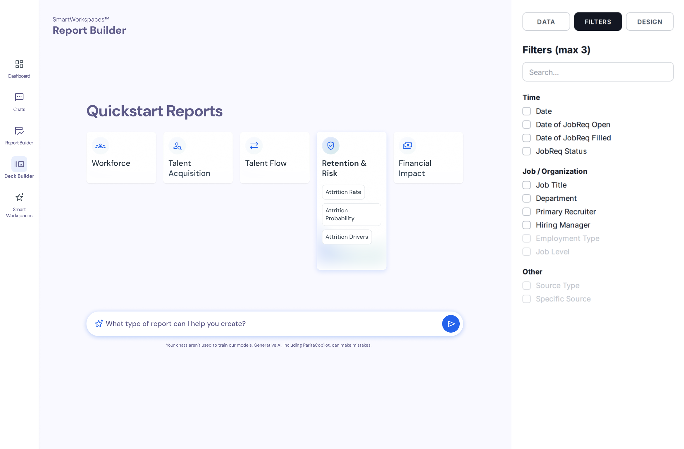
Not every user knows which report they need, but they usually know what they want to find out. The Report Builder has two ways in: build a chart the usual way with topics and filters, or type a question into the chat bar, such as "What's driving attrition?", and the AI builds the chart for you.
Both paths lead to the same output and the same filters, so a chart made from a question can be adjusted the same way as one built by hand. People who know exactly what they want keep full control, and people who don't are never stuck at a blank screen.
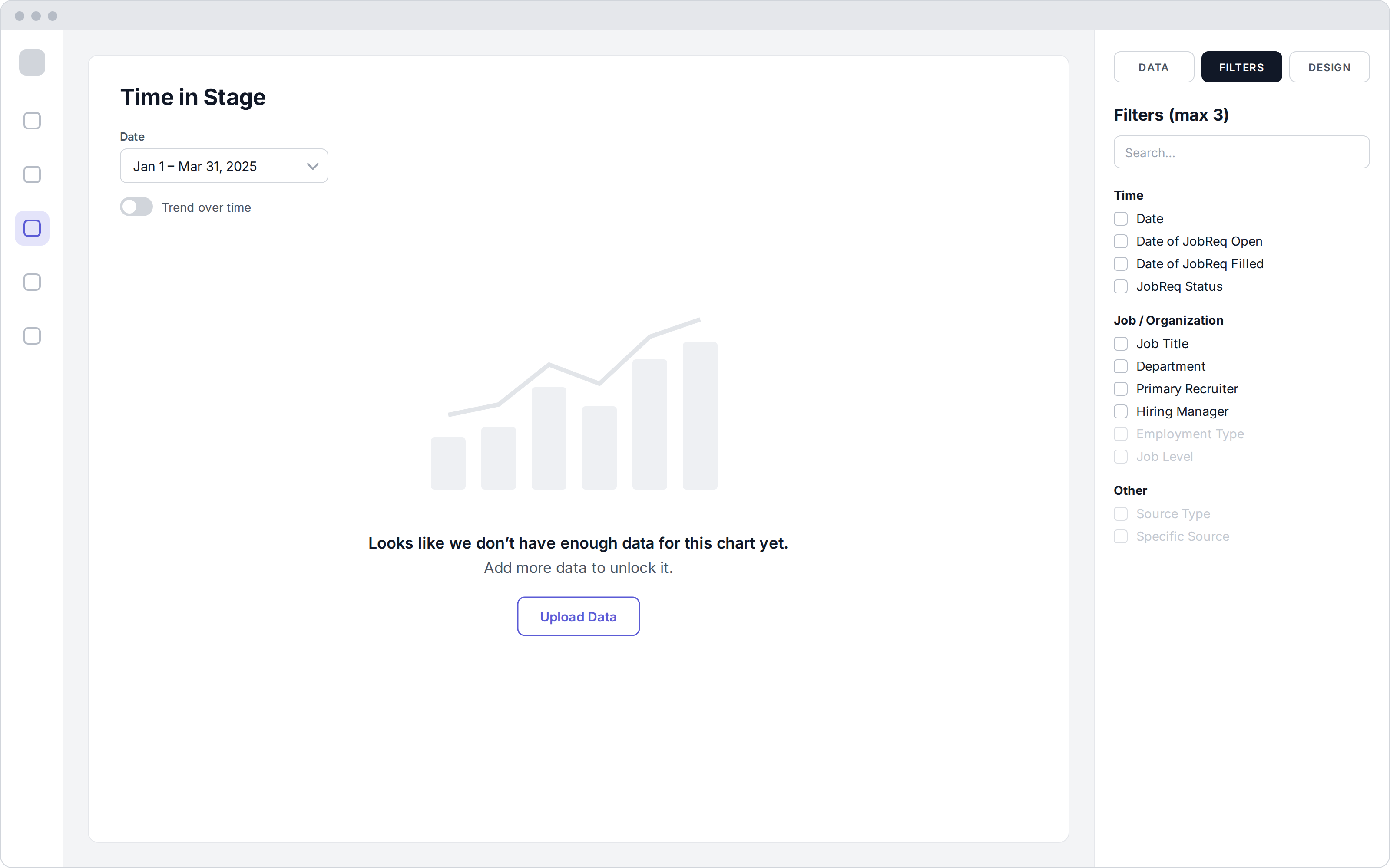
A chart built on thin data can shape real decisions about people. So the AI needed to know when to hold back.
Instead of a misleading chart, users see what's missing and how to fix it: "Looks like we don't have enough data for this chart yet. Add more data to unlock it."
Each slide shows its active filters, such as time range, department, and employee type, so anyone presenting it knows exactly which slice of the data they're looking at.
Users choose between "Create with AI" and building the deck themselves, and can switch between the two.
Speaker notes can be edited, rewritten, or regenerated.
Working fast in low-fidelity is what made this timeline possible. I could validate direction with stakeholders before investing in any polish.
Ran stakeholder discovery, then used AI to turn raw notes into structured user needs — fast.
Mapped the user flow and built low-fi wireframes in Whimsical, moving quickly because nothing was precious yet.
Shared low-fi concepts with the client to validate direction before investing in detail.
Built the final UI and worked out the chart-selection and filter logic with the team, using AI to help compile which chart fit which topic and filter set.
Shipped an AI Report Builder and Presentation Builder in four weeks: ask a question to get the right chart, then turn it into a draft deck with speaker notes.
HR partners can ask about their workforce in plain language and get a chart, without waiting on a BI team or writing formulas.
A topic, length, and date range become a full deck with charts chosen and speaker notes written. The job shifts from building slides to editing them.
When the data can't support a conclusion, the product says so and tells the user how to fix it, instead of guessing.
The most important design work on this project wasn't a screen. It was deciding how the AI should behave: which chart a given set of data calls for, and when the right answer is "not enough data yet."
If I kept going, I'd link each claim in the AI's speaker notes back to the data behind it, so presenters can defend every sentence in front of leadership.
I used AI throughout my own process too, synthesizing discovery notes, exploring directions quickly, and pressure-testing ideas, which is how one designer took this from kickoff to delivery in four weeks.