
Every year, roughly 80,000 eighteen-year-olds leave home to serve as full-time missionaries — most for the first time in their lives — each needing travel documents specific to one of 150+ countries. That process used to live in spreadsheets and email. I designed the portal that replaced it: one place where missionaries, families, and leaders could always see what came next, and where things stood.
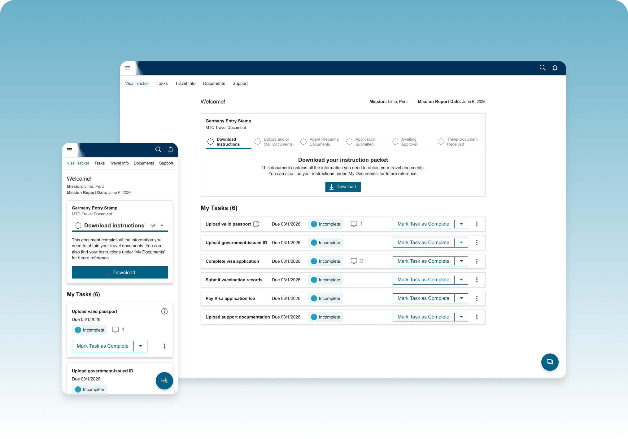
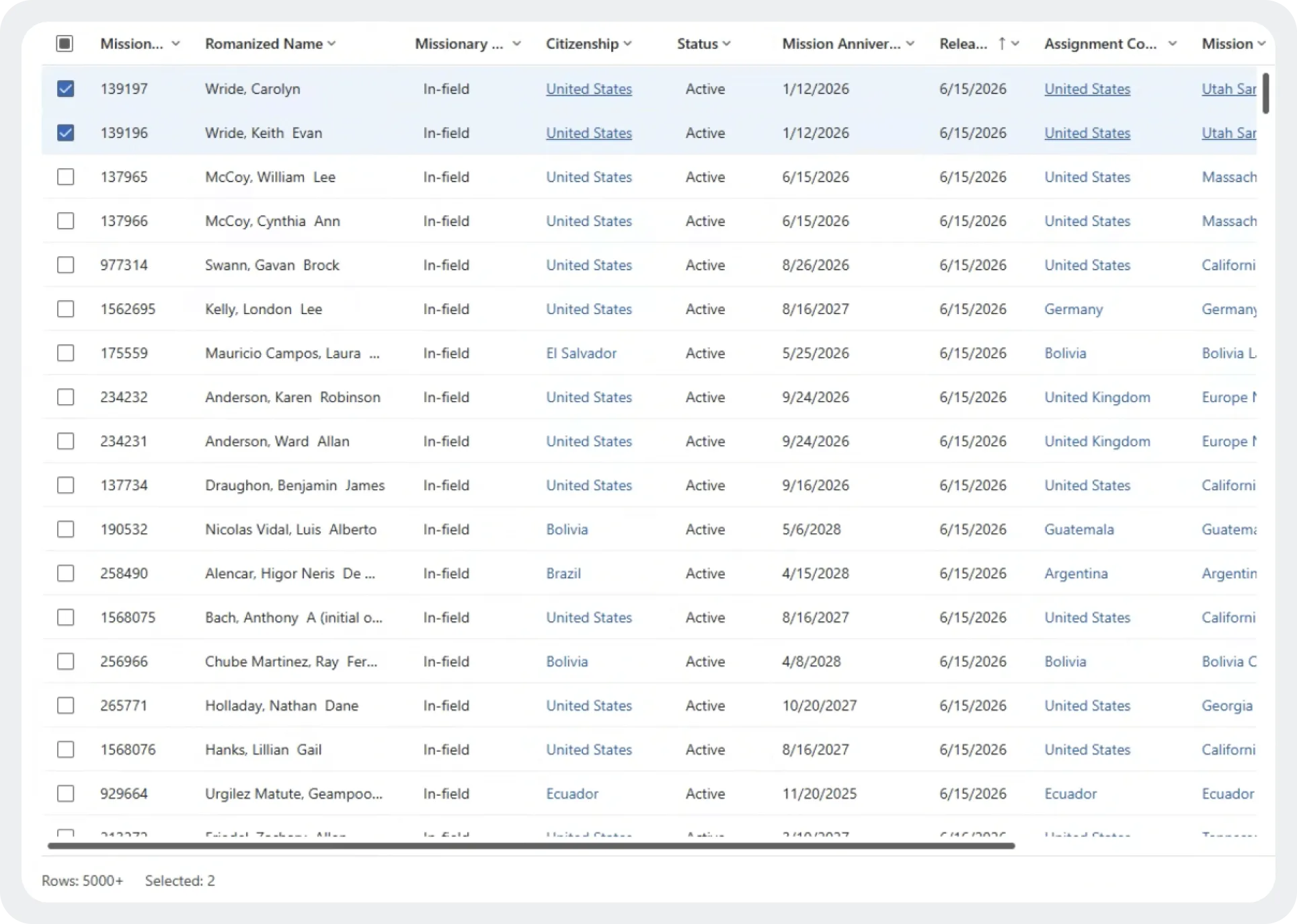
Every step in a missionary's paperwork lived somewhere different — instructions by email, tracking in spreadsheets, documents as attachments, status updates dependent on someone remembering to reply. Agents couldn't easily see who was stuck where. Missionaries didn't know if they were on track, behind, or waiting on someone else. And every one of the 150+ countries had its own requirements, with no consistent way to track any of it.
Layered on top: most of these travelers were 18, many leaving the country for the first time, doing something logistically complicated with real deadlines — and real consequences if it went wrong.
Clear enough that a first-time traveler never had to ask for help — fast enough that paperwork never became the bottleneck to their travel date.
The missionary, their family, and their leaders could all see exactly where things stood, at every point in the process.
Flexible enough to handle every country's distinct document process without turning into 150 different products.
This wasn't a product with one clear process to design for. It had to hold up across 150+ country-specific requirements, more than one user per application, systems it didn't own, an audience that had never done this before, and a brand system with zero room to bend.
Every travel document type carried its own prerequisites, forms, and issuing rules; nothing about the underlying process was standardized.
Task and status data had to be pulled via API from systems already in use by the organization, not invented from scratch.
Mostly 18-year-olds doing this, and international travel, for the first time; every instruction had to assume zero prior context.
Strict, established visual standards that still needed to feel approachable to teenagers.
Every decision came back to these three principles.
At every step, the user (and anyone they gave access to) could see exactly what was happening, what was next, and whose job it was: theirs, or an agent's.
Almost no one using this had done it before, every instruction was written and sequenced as if for a first-timer, not an expert.
This process marks a genuine rite of passage for these teens; the design leaned into that excitement instead of treating it like a compliance form.
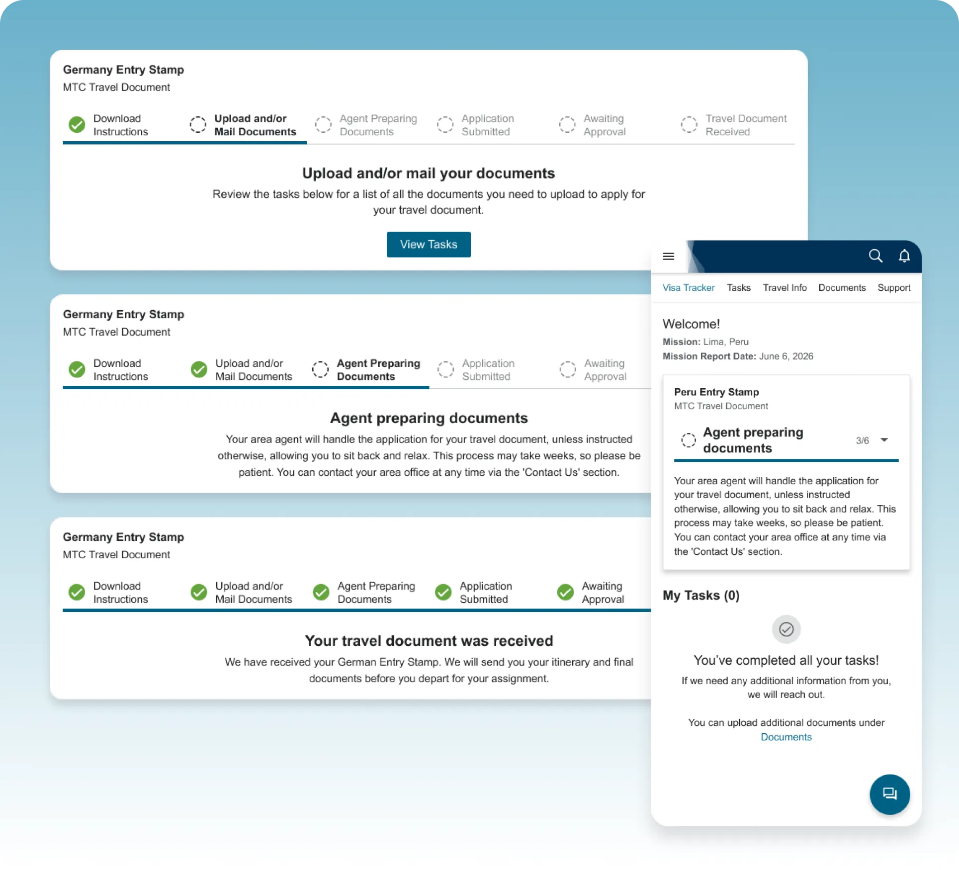
Status visibility was a defined requirement — the most direct fix for the old system's biggest problem: no one could tell where an application stood. I wanted the tracker to borrow from something this generation already trusts: the real-time, staged tracking of food delivery and package apps, so checking on a document felt like watching progress, not filing a form. Strict brand guidelines meant the final version stayed simple — a clean, staged progress indicator rather than an illustrated metaphor — but the mechanic held: a black box became something checkable, and something checkable made the wait feel like progress.
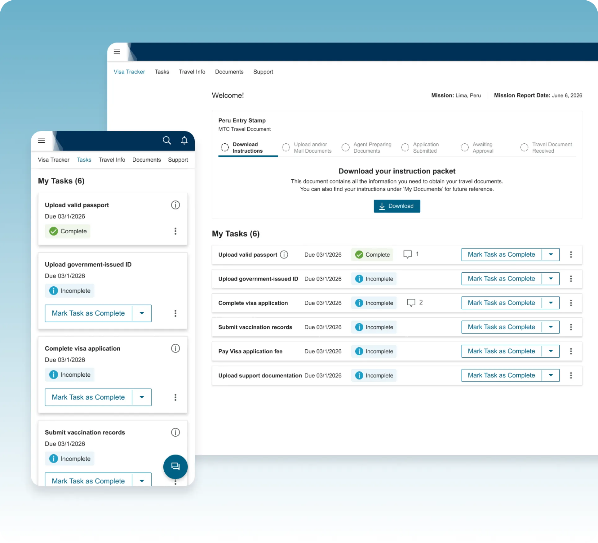
The original plan was one standard task list for every missionary. A product expert flagged the reality: requirements varied entirely by destination — a German entry stamp and a Peruvian visa had almost nothing in common, from vaccinations to fees to forms. That reshaped the approach: instead of a static checklist, tasks generate dynamically per traveler, mapped from the same internal "contact record" agents already relied on. One interface for everyone, but the content inside is unique to wherever they're headed.
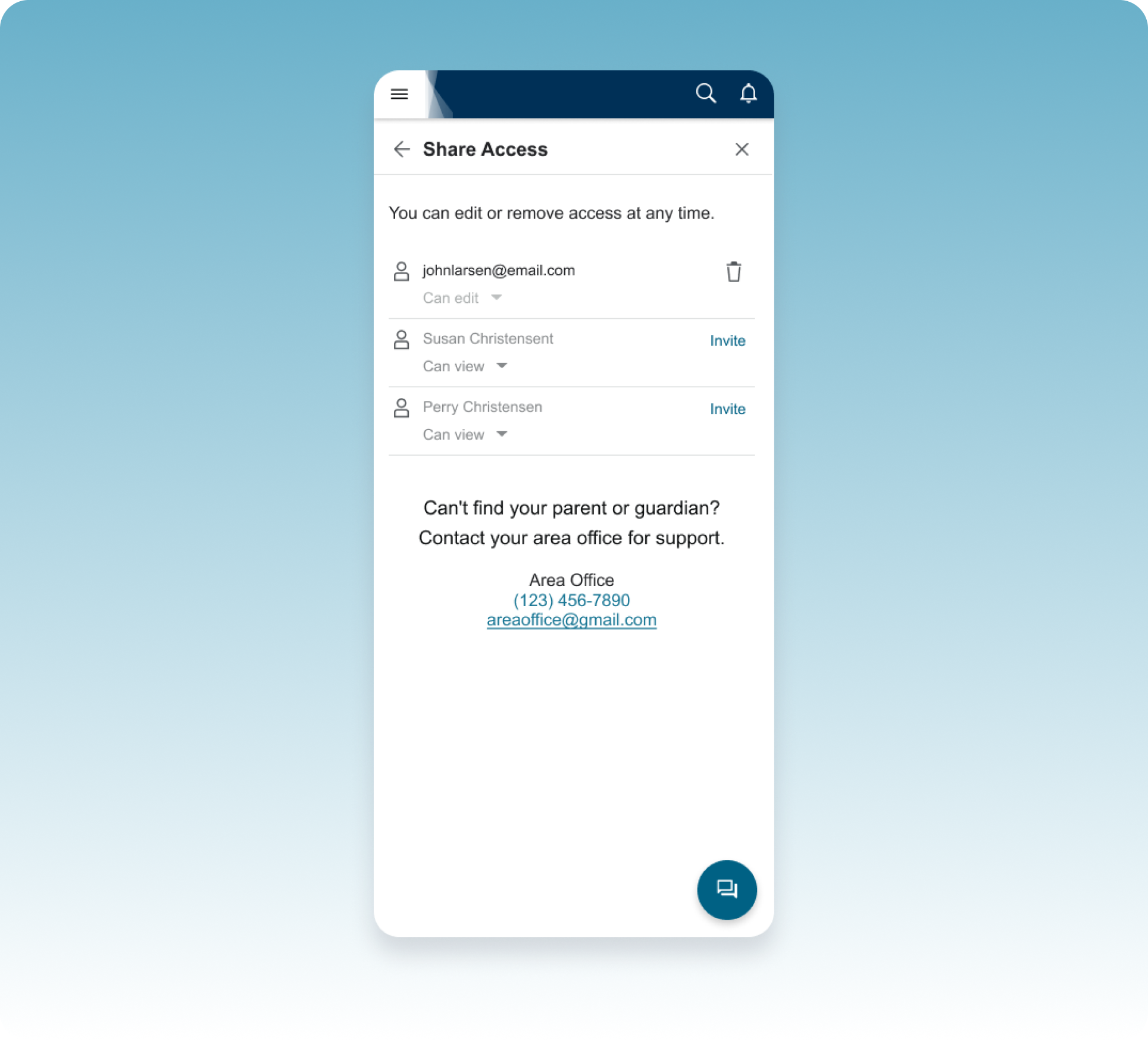
Missionaries needed to own their application, but they weren't doing this alone — parents helped gather documents, guardians co-signed forms, and local leaders often stepped in for support. Rather than a single shared login (a common but risky workaround), I designed a permissions model where a missionary could invite specific people — a parent, guardian, or leader — and choose whether each person got view-only or edit access. That kept ownership clear while still making it easy to get help.
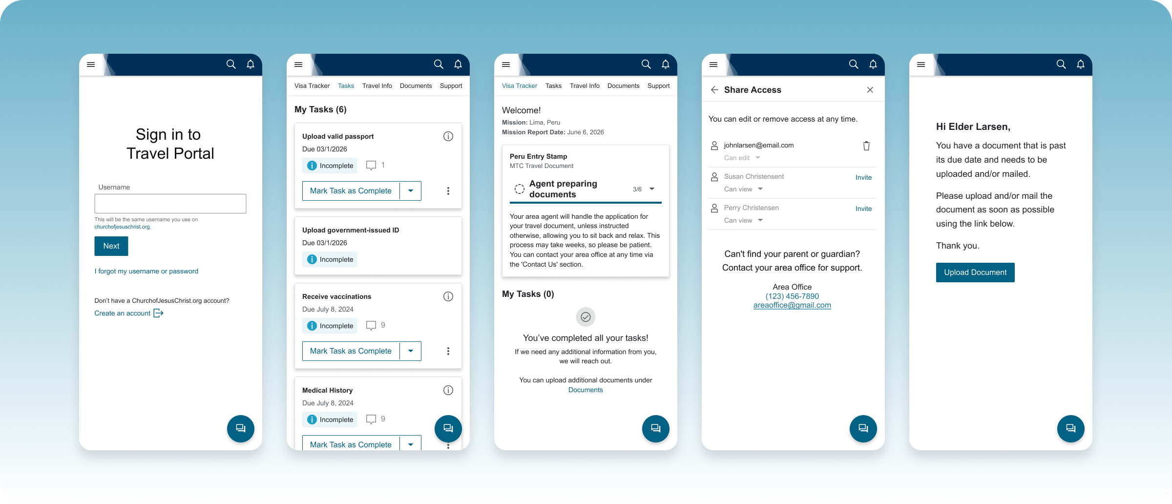
A single home base for something that used to live in spreadsheets and inboxes.
A short, structured intro that got first-time users oriented before showing them everything at once.
Step-by-step instructions unique to each traveler's destination, generated automatically rather than maintained by hand.
A visual, stage-based progress tracker that turned an anxious waiting period into something users could check anytime.
A secure place to complete and submit required documentation, handed off directly to the agent preparing the application.
Owner access for the missionary, with optional view or edit access for a parent, guardian, or leader.
Alerts any time an agent needed something new or the application's status changed, no more waiting on a reply.
This was a 0-to-1 product — there's no "before" data to compare it against, because there was no comparable system to measure. Everything before this lived in emails, phone calls, and spreadsheets. So the outcome here isn't a set of metrics; it's what changed for the people actually going through the process.
for about 80,000 missionaries a year and their families.
Status, tasks, and documents used to live scattered across inboxes, phone calls, and spreadsheets, with no one place that reflected what was actually true. Now there's one, and everyone involved is looking at the same information.
Not 150 separate ones — a real operational shift for the team behind it, not just for the travelers using it.
This process didn't get shorter because of this project — there are still just as many steps: read the instructions, complete the tasks, upload the documents, hand off to an agent, submit, and wait. What changed was whether people could see themselves inside that process. Once status, next steps, and ownership were visible to everyone involved, the same number of steps stopped feeling like a black box and started feeling like progress.
You don't always need to remove complexity to make something feel simpler. Sometimes you just need to make it visible.