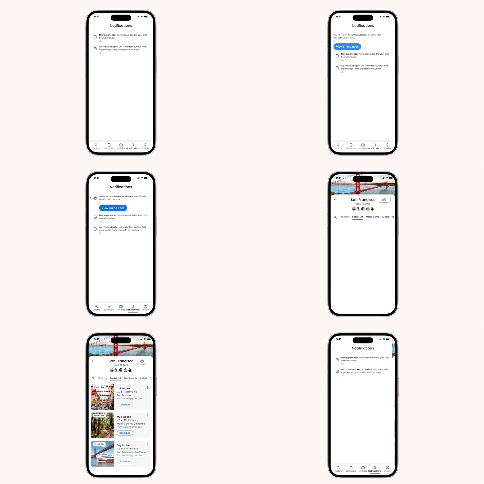
Most travel planning happens across five different tools — a Notes app, a spreadsheet, a group chat, and an inbox full of confirmation emails nobody can find again. As the sole Product Designer on a 0-to-1 startup product, I used early user research to shape a collaborative trip planner around how people actually plan — launching on both app stores with a 5.0 rating.
.png)
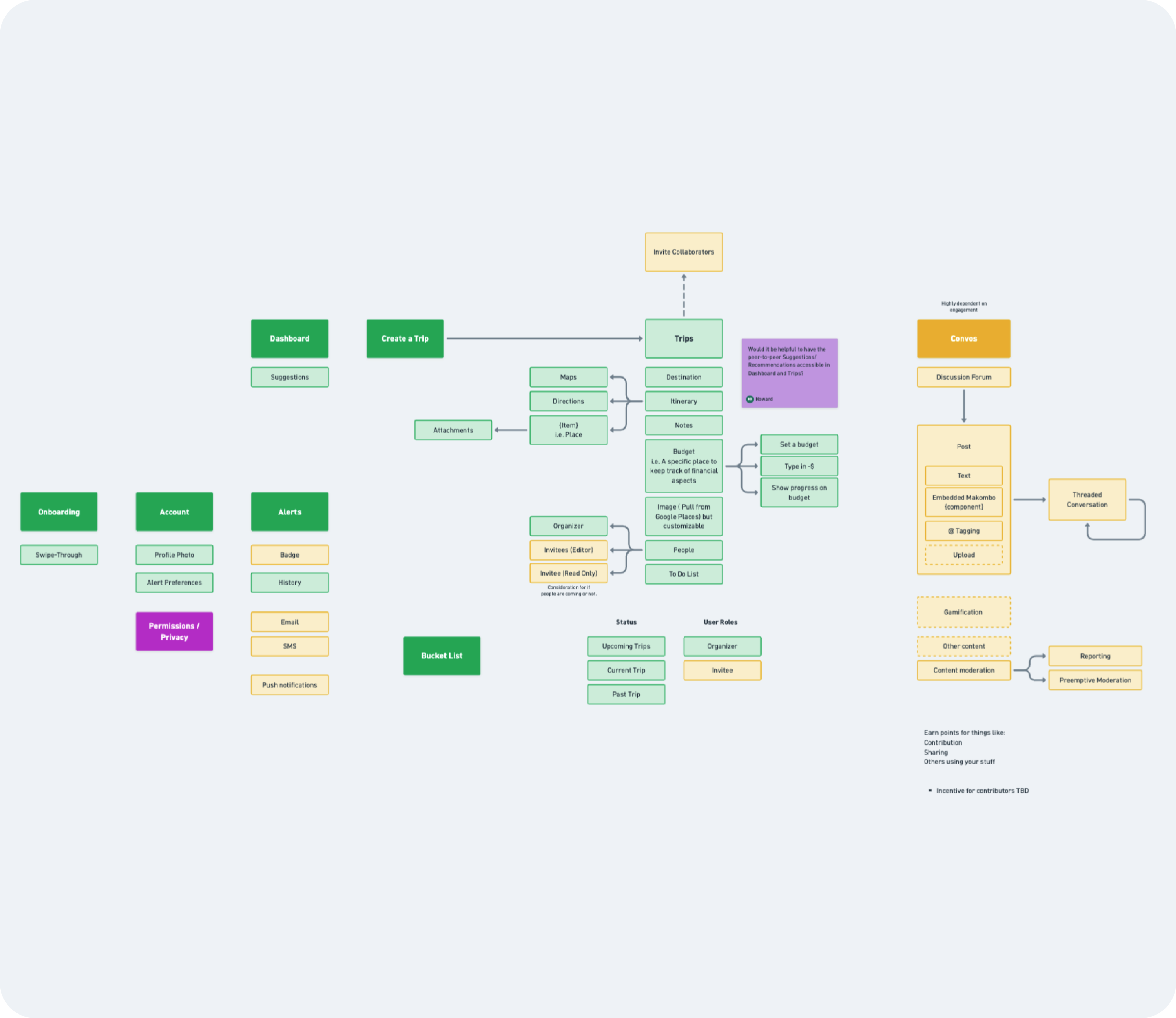
A startup founder brought me on to design a brand-new travel planning app — a 0-to-1 product entering a crowded market with no clear leader for how groups plan trips together. The goal: launch in both app stores, make collaborative planning easy on mobile, and surface recommendations better than the generic "top 10" lists people were already tired of.
I ran discovery sessions with the founder to align on business goals, target users, and pain points, then scoped the MVP versus fast-follow features — cutting things like budgeting to protect the launch timeline.
This was always meant to be a collaborative trip planner — travel plans rarely happen solo. But knowing that and knowing what collaboration actually needed to look like were two different things. I built a mid-fidelity prototype of the core flow — creating a trip and adding something to it — and used it to run a combined round of usability testing and user interviews with real travelers.
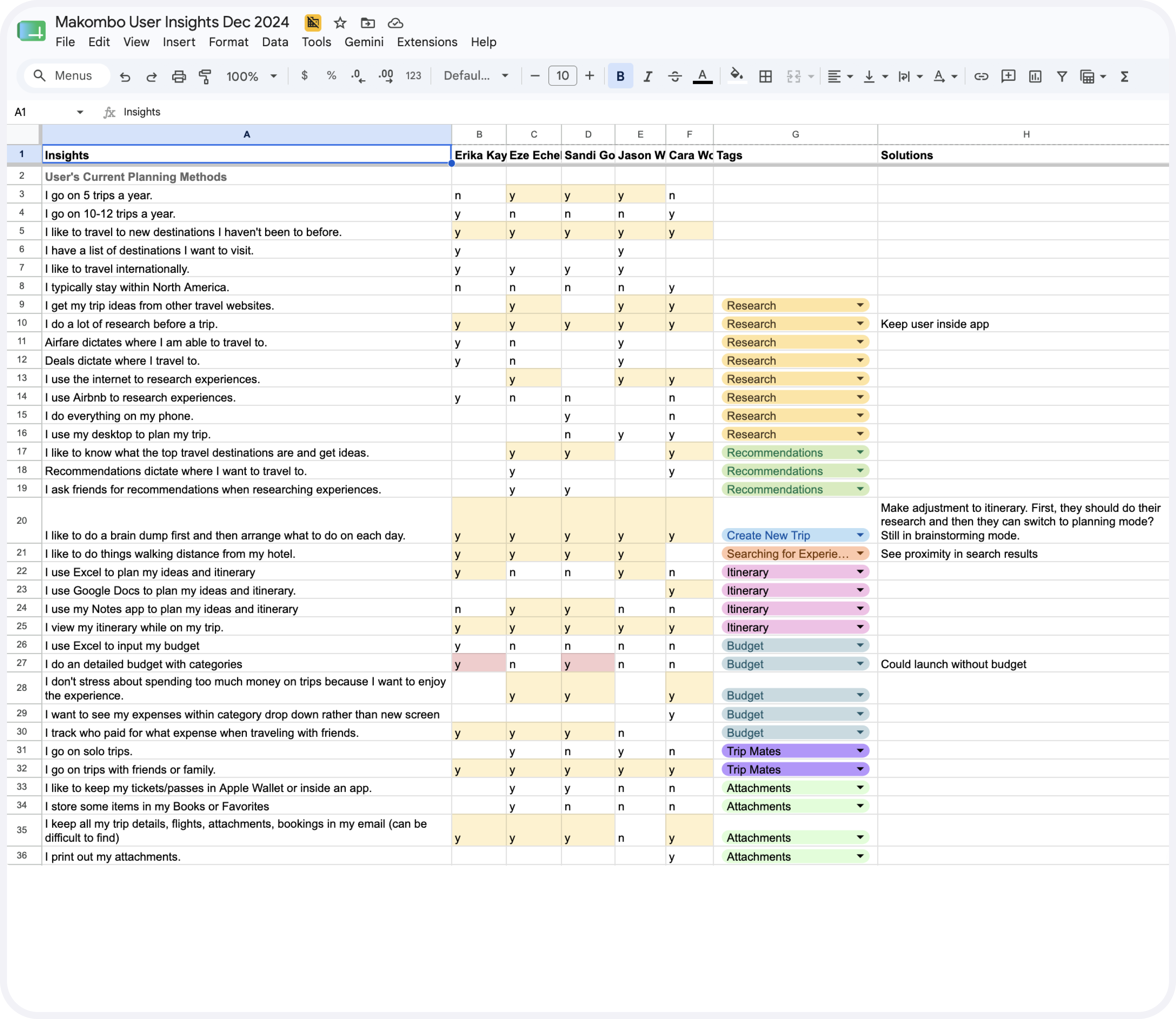
The research reshaped the product almost immediately.
A few findings stood out:
100% of testers asked for this — without being prompted.
Every tester, without being prompted, wanted to see how close their lodging was to everything they were considering — ideally within walking distance.
People plan across multiple days at once, but once on the trip, they only want to see one day at a time.
Group trips almost always collapse into one person doing all the planning, because real-time collaboration is hard — everyone else just goes along with whatever gets decided.
People "brain dump" first, saving anything that looks interesting, and organize it later. Most were doing this in spreadsheets, Google Docs, or Notes.
Trip details — flights, confirmations, bookings — live scattered across email and are nearly impossible to find again once the trip starts.
Instead of guessing at what "collaborative" should mean, I designed toward three specific things:
Give users a place to collect ideas first, then turn them into a schedule when they're ready.
Make group decision-making part of the core flow, not something users have to work around.
Keep the plan flexible enough to adapt once the trip is actually underway.
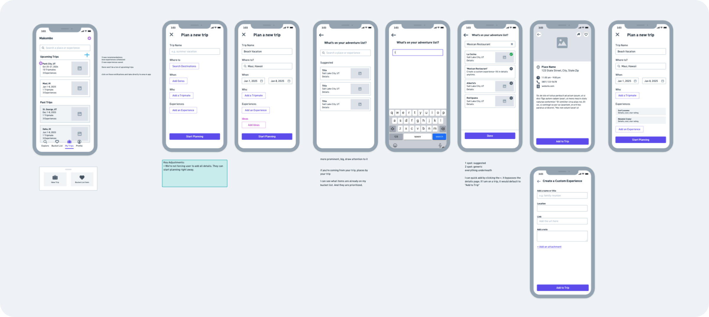
As the sole Product Designer, I owned the experience end to end: discovery, site mapping, and user flows, followed by a low-fidelity prototype of the core flow, user interviews and usability testing, and synthesis of the findings. From there I moved into low-fidelity wireframes in Whimsical, got stakeholder approval, and designed high-fidelity screens alongside close collaboration with engineering through launch.
Because this was an early-stage startup with limited resources, my role also extended past product design. I designed the pre-launch marketing site, an email campaign, and social GIFs and animations used to build excitement ahead of launch.
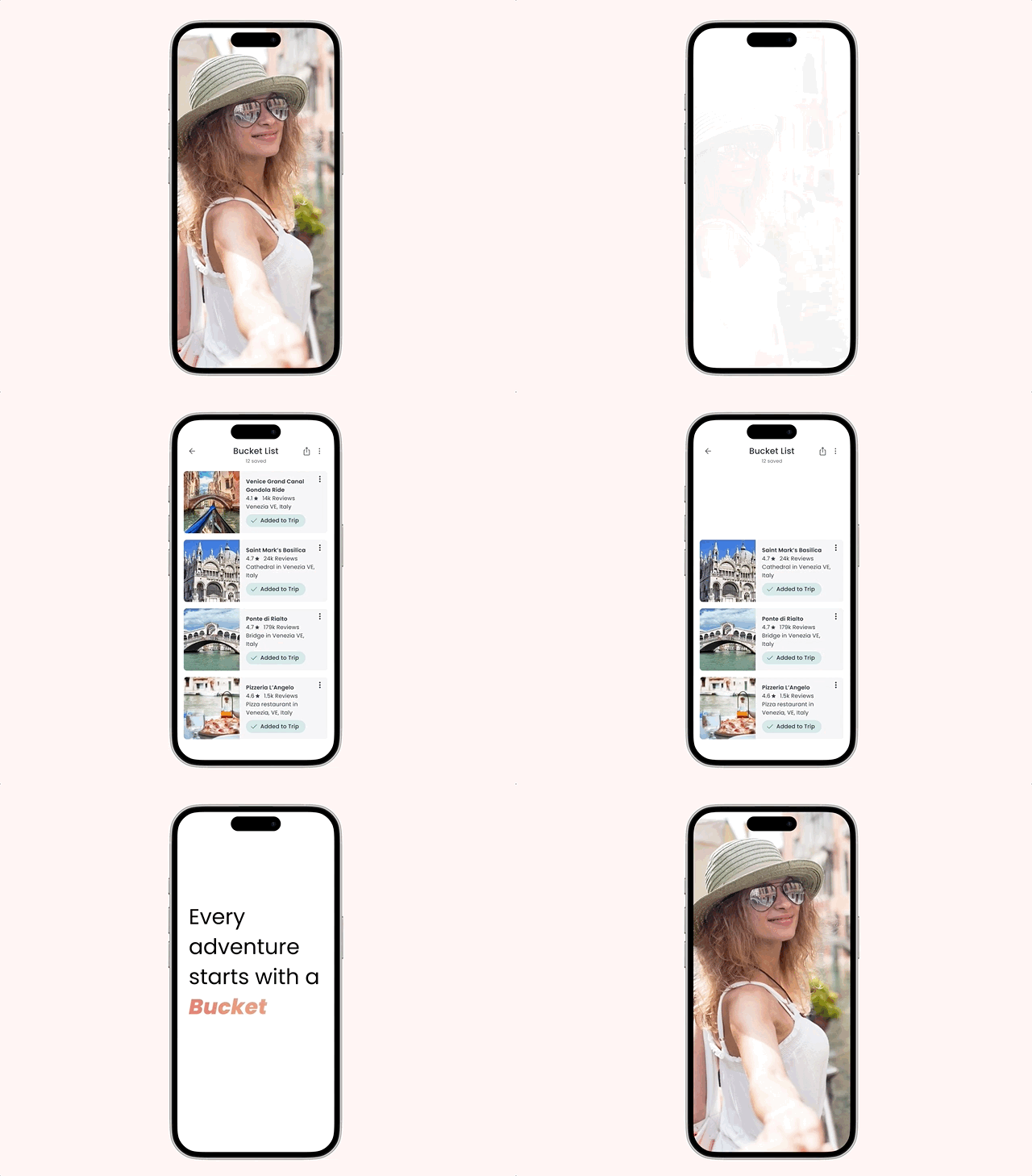
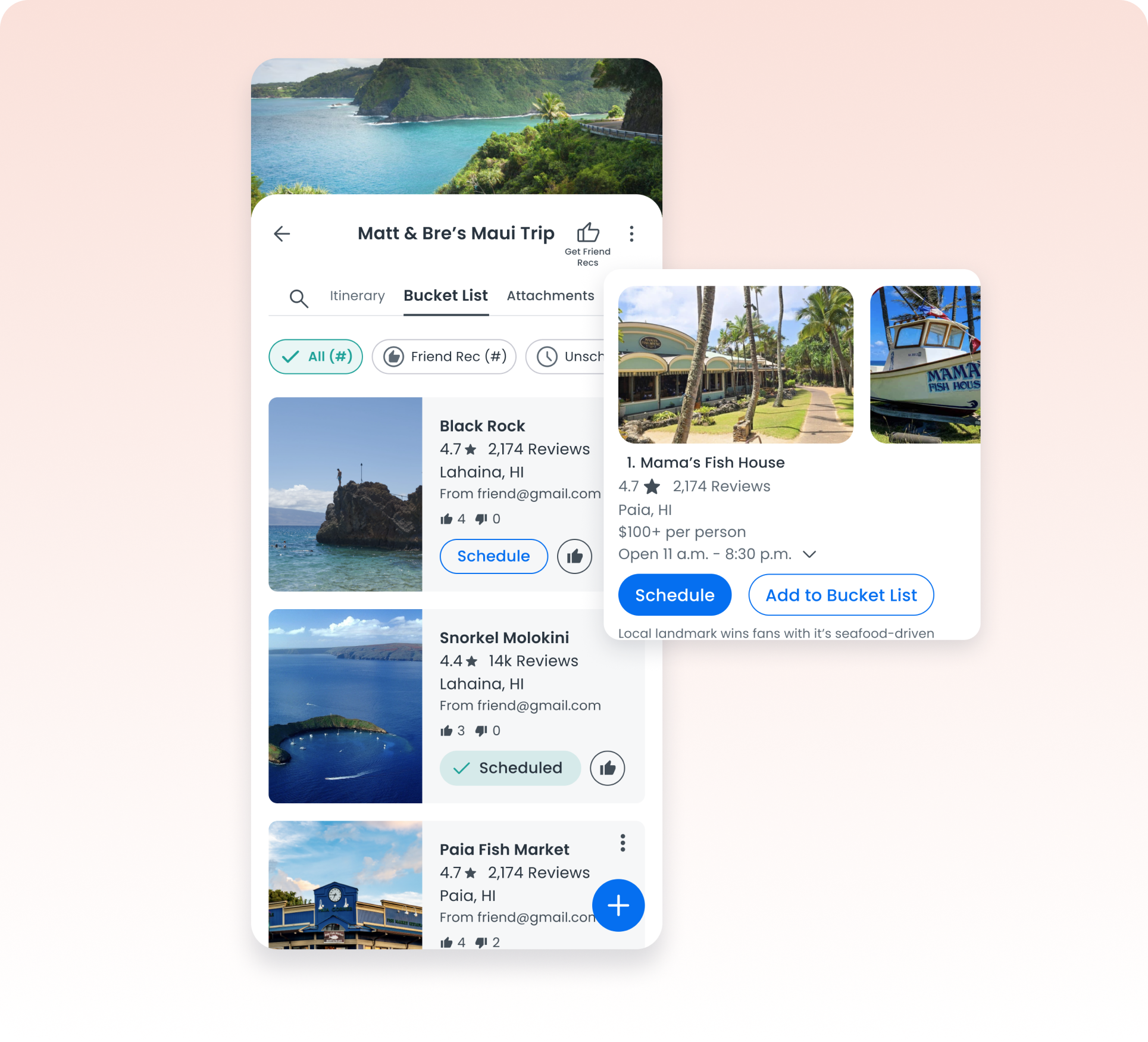
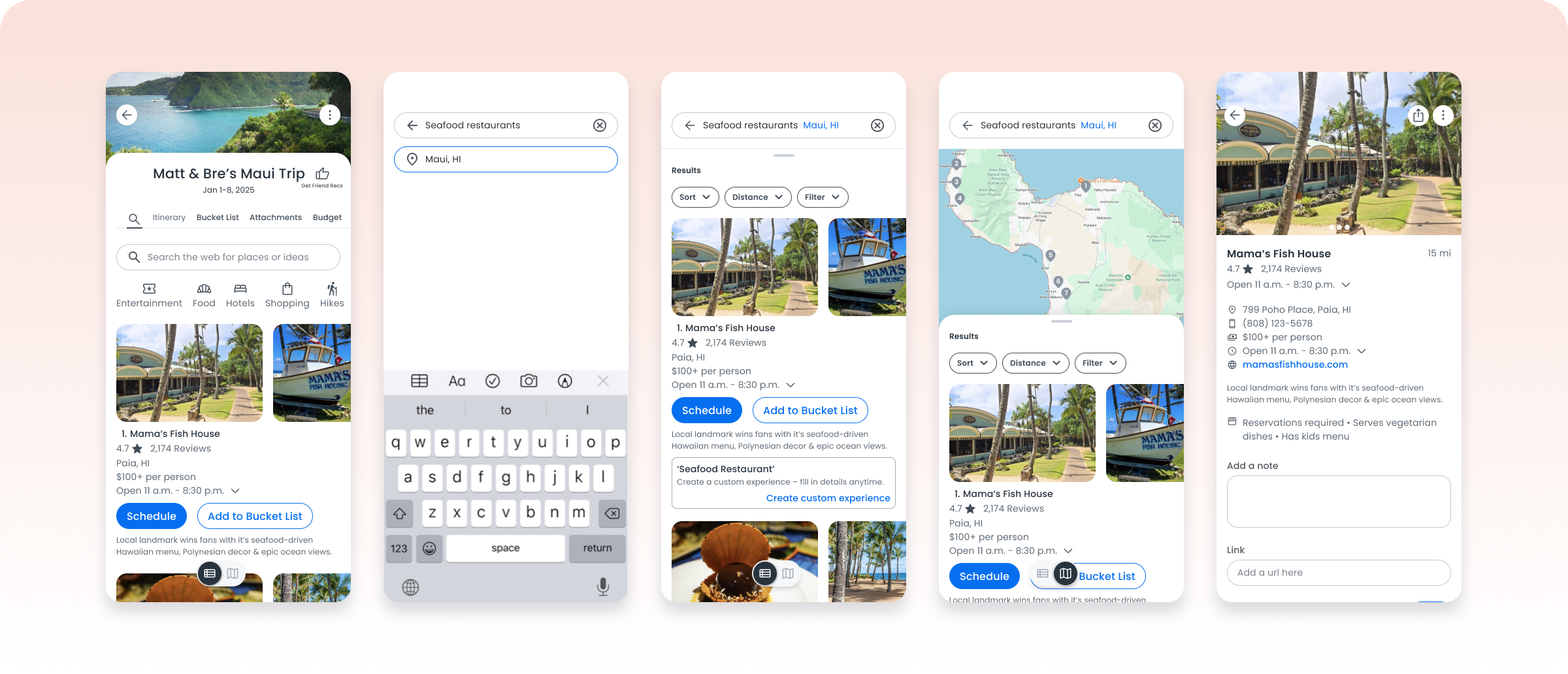
Instead of forcing users to slot every idea directly into a schedule, I designed a bucket-list model that let people save experiences first and organize them into a day-by-day plan later — matching the brain-dump-then-organize behavior we saw in research.
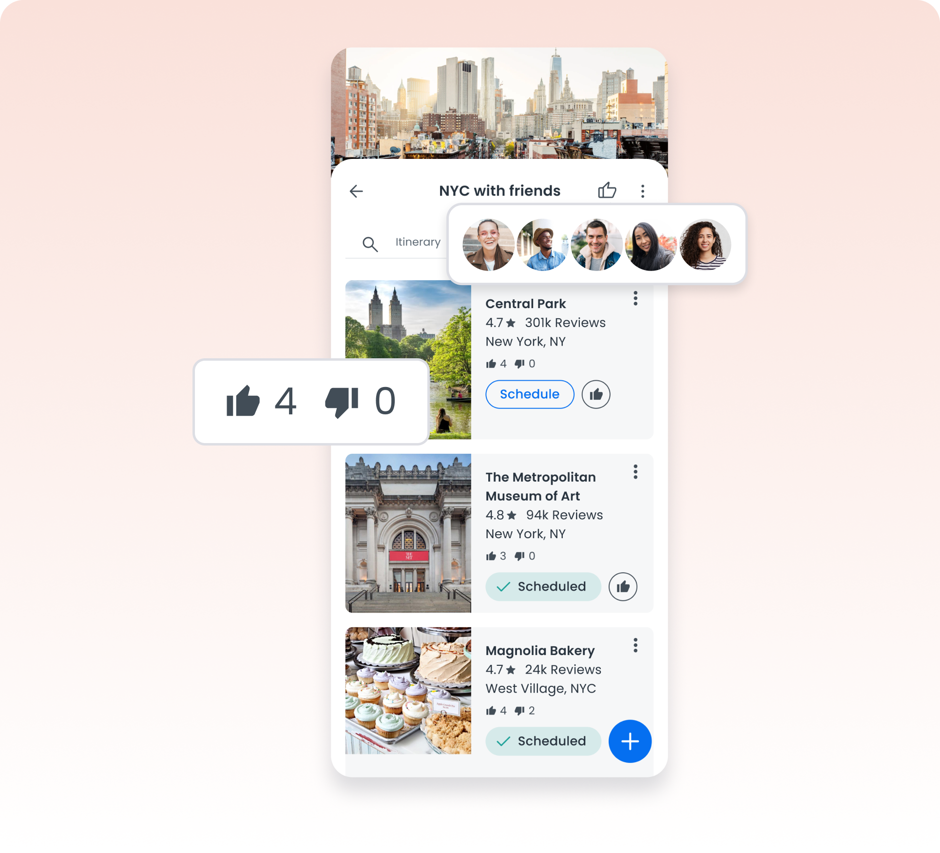
Since group planning kept collapsing onto one person, I designed collaboration directly into the saving and deciding process. Tripmates could like or dislike saved experiences to reach consensus without a separate group chat, and use a "Get Friend Recs" link that let friends outside the trip send recommendations directly into the plan.
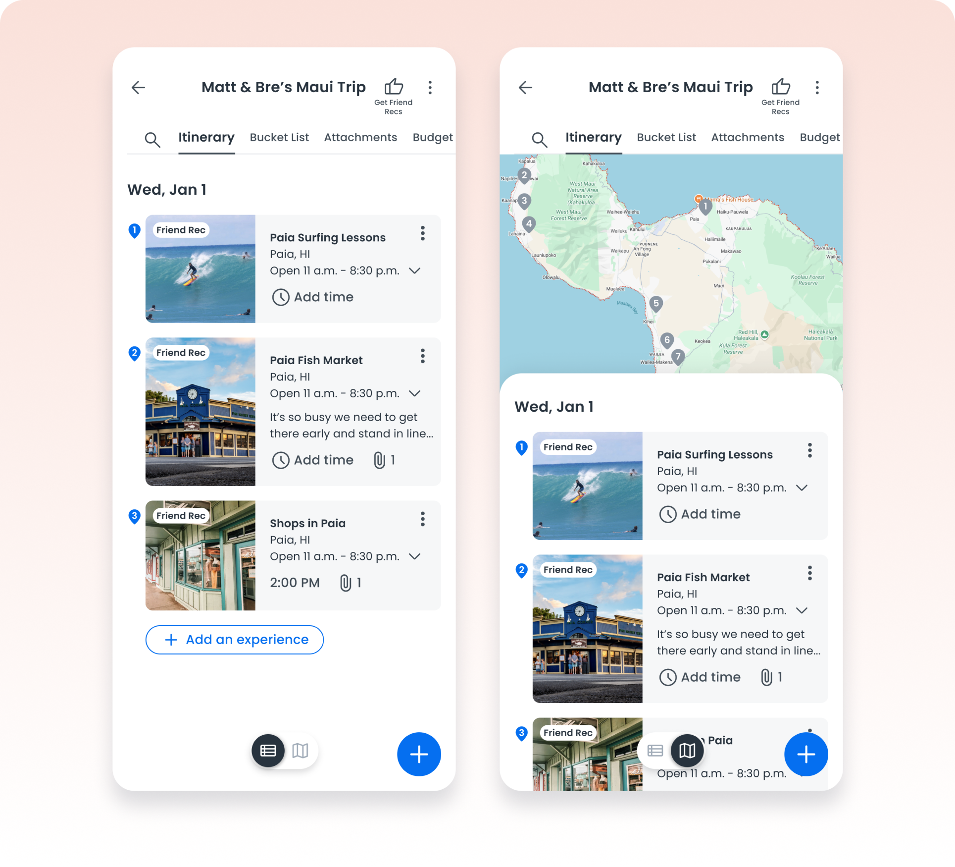
Plans change on the ground — a restaurant is too crowded, a spot closes early. I designed the itinerary to stay fully editable at any point: travelers can drag and reorganize their day, or move an experience to a different day, whether they're planning weeks out or mid-trip. On the day of, the map view also surfaces unscheduled bucket-list experiences nearby, so travelers can see what else is close and pivot without leaving the app.
Launching a 0-to-1 product with a small startup team meant constant tradeoffs:
There wasn't time to build both desktop and mobile, so we focused entirely on the phone — designing the navigation and structure to handle a full trip plan without feeling cramped.
To launch fast, we deprioritized planned MVP features like budgeting, pushing them to a fast follow.
Google Places search results surfaced chains like McDonald's above unique, well-reviewed spots. I worked with engineering to filter and rank results by rating, relevance, and recommendation instead of just proximity.
"It's Pinterest for travel!"
Save ideas first, organize them into an itinerary later, matching the natural brain-dump-then-plan behavior of travelers.
Like/dislike voting, trip sharing, and a "Get Friend Recs" link bring group decision-making into the app instead of scattered group chats.
Search results filtered and ranked by rating, relevance, and recommendation, not just proximity, to surface better spots than the obvious chains.
Makombo launched on both the App Store and Google Play with a 5.0 rating, introducing a set of collaboration and planning features that didn't exist together in the category.
More telling than the rating itself: early reviews validated the exact problem the research surfaced — nearly word-for-word the fragmented-planning complaint from months earlier, a strong signal the product solved the right problem.
The product's positioning also landed the way the research pointed: one early review described Makombo as "Pinterest for travel" — exactly the inspiration-and-planning experience the research confirmed travelers wanted, not just a place to store confirmed bookings.
"I don't have to store my travel planning info in docs and then try to remember where I put them."
This project reinforced something I now build into every product I design: you can't know what users actually want until you ask them. I would never have guessed that travelers wanted to see their lodging plotted against every experience they were considering — but every single tester asked for it, unprompted. Designing around that early research, instead of my own assumptions about what a "travel app" should be, is what let this product launch with features the category didn't have yet.