
Every dental visit starts with an insurance check nobody sees — a manual, repetitive process billing specialists repeated for every patient, every visit. I redesigned this workflow around a new automation partner and two very different users, so the software could handle the repetitive work and the people could focus on judgment calls.
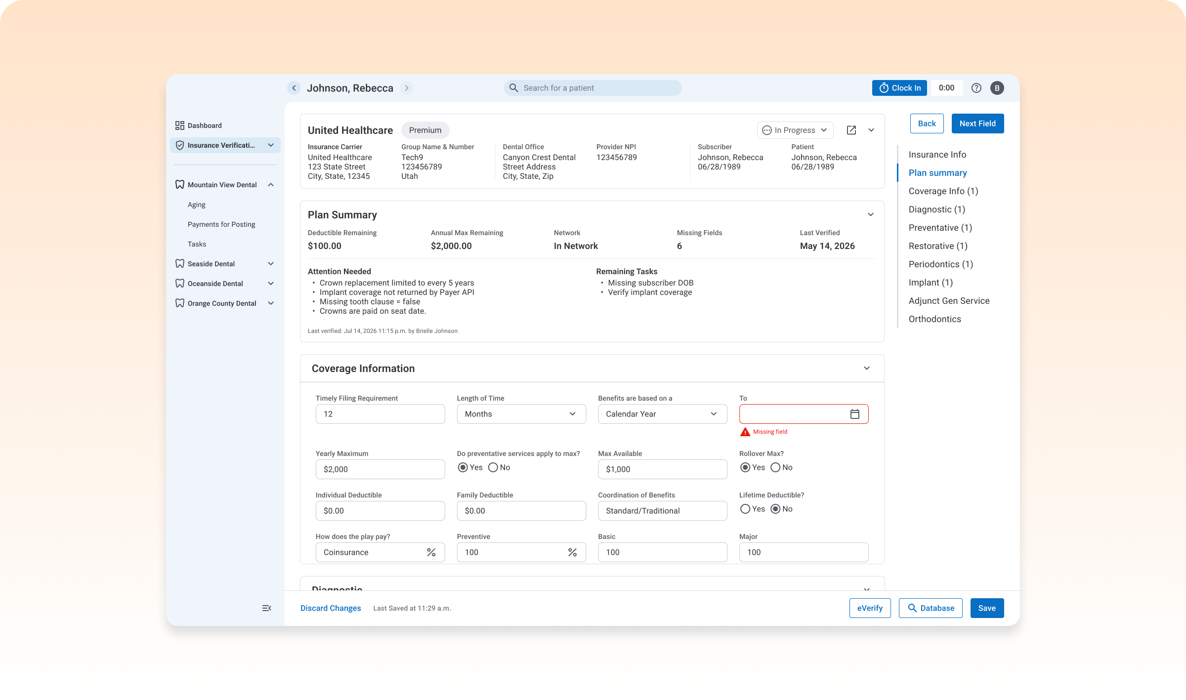
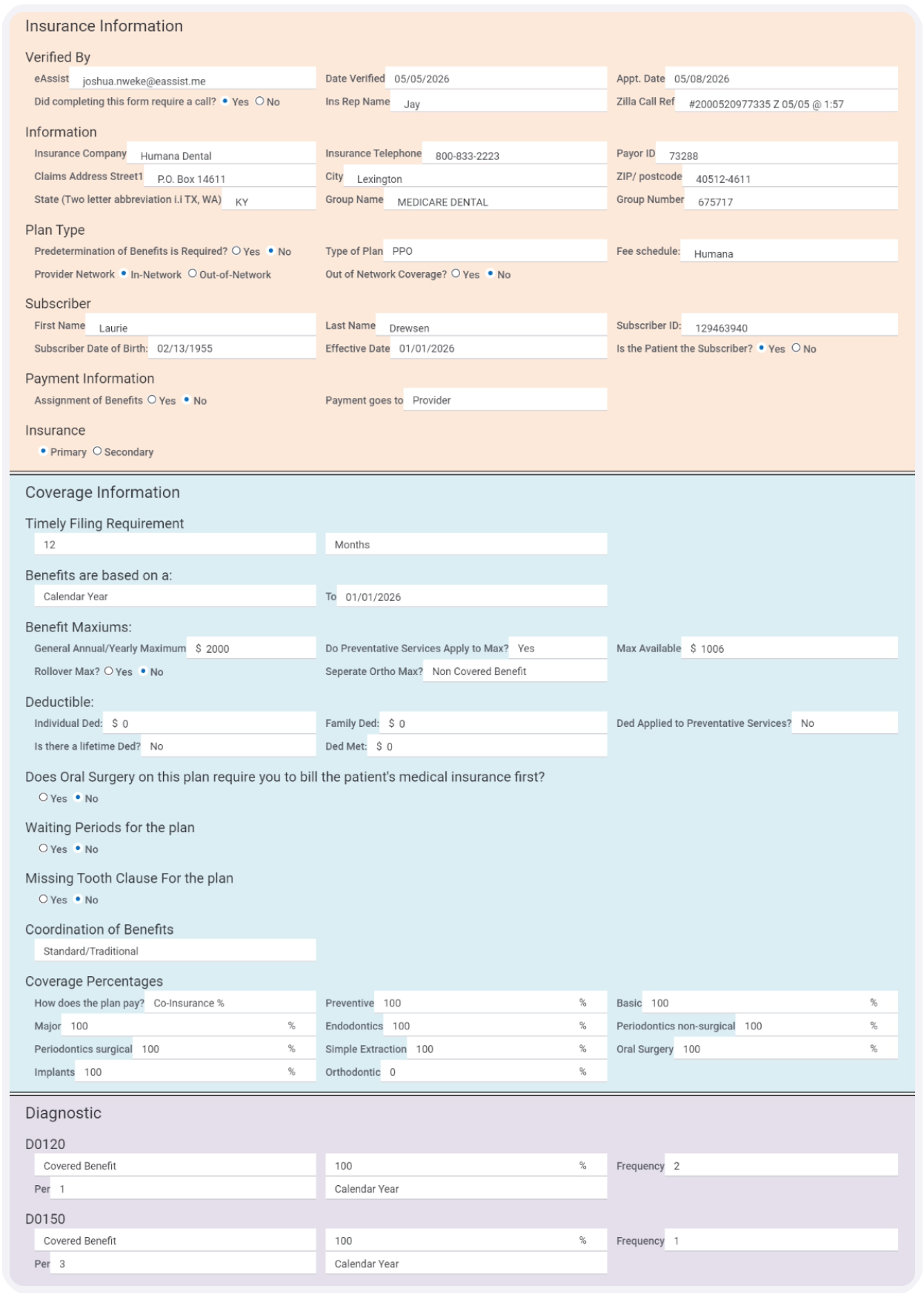
Confirming a patient's insurance was a manual process: dental billers logged into a different portal for every carrier, checked coverage against databases that weren't always accurate, then hand-filled a long verification form — for every patient, every visit.
The team's answer was Zuub, a third-party service that connects to insurance carriers' APIs and pulls coverage data automatically. That solved the accuracy and data-entry problem. It also created a design problem: once software fills in most of a form, what's left for the human to do — and how do two different users, with two different jobs, work off the same information without stepping on each other?
Zuub could fill in most of a form, but a biller still had to find what it couldn't. The goal was to turn a full manual review into a short, guided one.
Dental offices needed to see where a verification stood, and a fast, HIPAA-compliant way to communicate with billers about it, without picking up the phone.
Replace manual database lookups, which weren't always accurate, with a live connection straight to the carrier.
Billers often worked from a single laptop, making side-by-side work difficult. Zuub also required manually connecting ~20 insurance carriers per dental office. Meanwhile, billers and dental offices needed a HIPAA-compliant way to communicate about requests.
Billers are typically contractors who purchase their own equipment — usually a single small laptop, with no room to compare two windows side by side.
Zuub only worked after a biller manually connected it to every insurance carrier for every dental office they worked with — often close to 20 carriers before the automation paid off.
Billers and dental offices needed to communicate constantly about the requests, but couldn't do it over email — which meant defaulting to phone calls.
Zuub pulls the facts; people decide what to do with the exceptions.
Both users work from the same request, with permissions — not separate tools — drawing the line between them.
Status, request progress, and communication between users all stayed visible, so nothing required a phone call to find out.
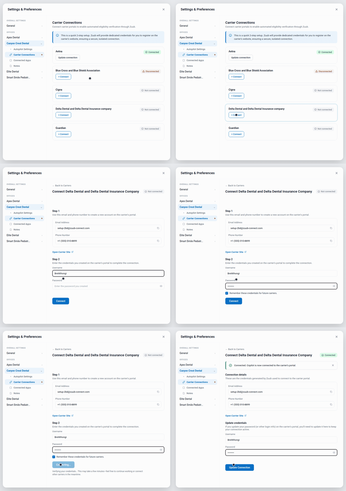
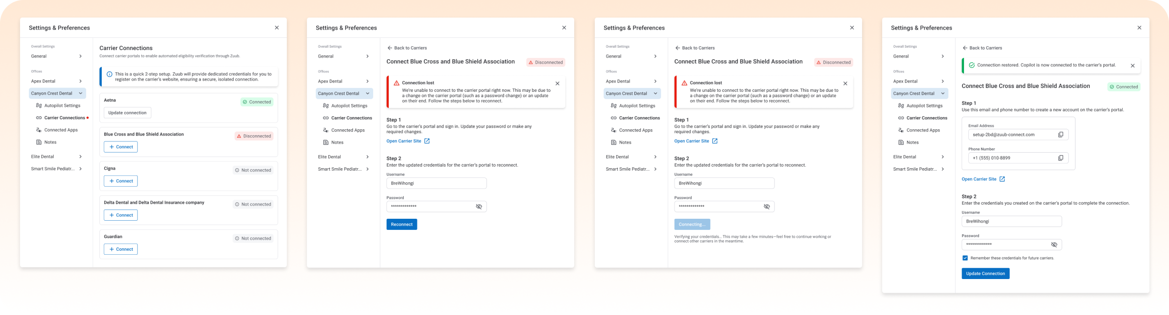
Before a biller could verify anything, they had to connect Zuub to every insurance carrier, for every dental office they worked with — often close to 20 connections before the tool paid off. Rather than try to make that setup shorter, I made it trustworthy and resumable: each carrier lives in its own settings row with a status you never have to guess at (Connected, Disconnected, Not connected), connecting is two steps on one screen, and a "connection lost" state explains why a carrier dropped and walks the user straight into reconnecting instead of surfacing a generic error.
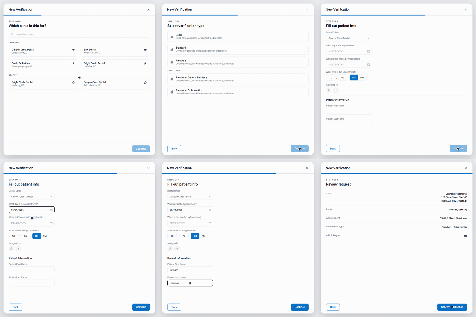
Billers often worked across several dental offices at once, each with its own clinics and patients. The old flow for creating a request asked for everything on one screen — easy to mix up with no second monitor to double-check against. I broke it into steps: clinic, verification type, required patient info, then a final confirmation. Each choice happened on its own, and the confirmation step gave the biller one last chance to catch a mistake before it became the dental office's problem.
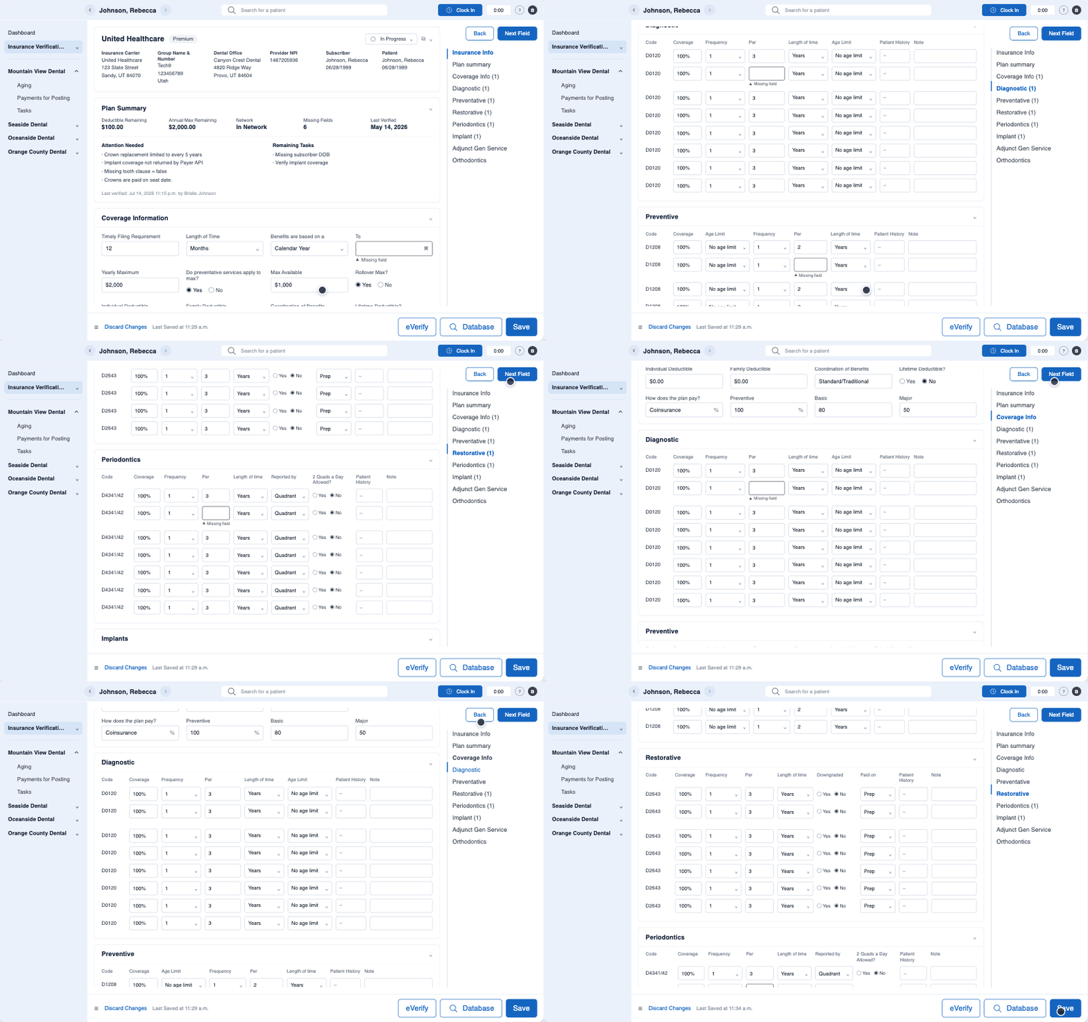
Zuub filled in most of a verification form, but "most" still meant a biller had to comb through a long form to find what was missing — exactly the manual effort we were trying to design away. I made incomplete fields visually distinct from everything Zuub had already filled in, and let billers jump directly from one open field to the next instead of scrolling. The job shifted from filling out a form to closing a short, visible list of gaps.
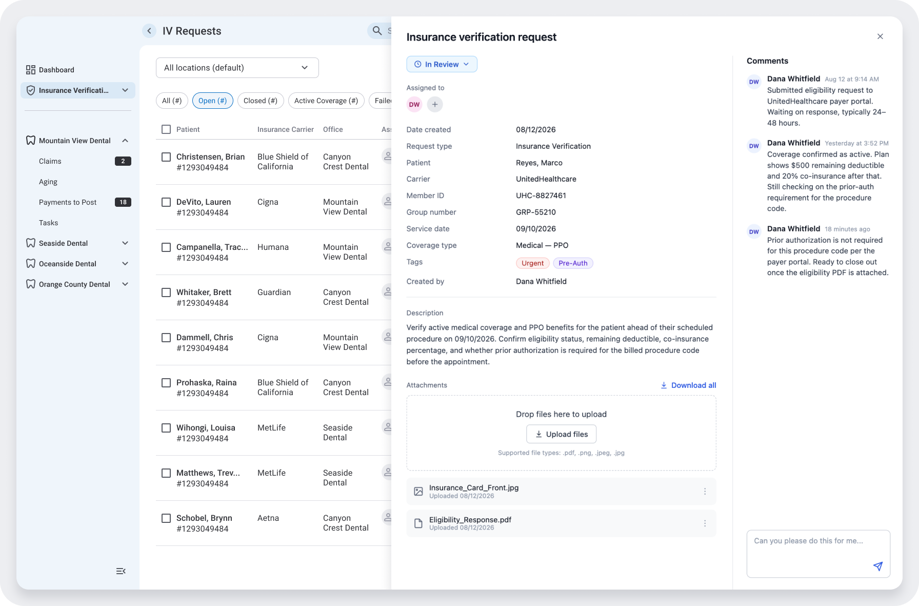
Both users had visibility into a request, but visibility alone didn't solve the constant back-and-forth between them — and email wasn't HIPAA-compliant, so phone calls were the default workaround. I built comments and file attachments directly into each request, with notifications when something new came in, so a dental office could flag a problem or a biller could ask a question and know it would be seen — without leaving the tool, and without breaking compliance.
A dedicated settings area where every carrier's status: connected, disconnected, not yet set up — is visible at a glance, with a guided two-step flow to connect and a clear recovery path when a connection drops.
Incomplete fields stand out from everything Zuub already filled in, with direct navigation between them so nothing gets lost in a long form.
A step-by-step flow — clinic, verification type, patient info, confirmation, that keeps billers working across multiple offices from mixing up a request.
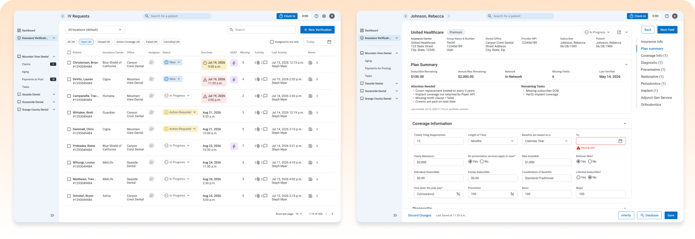
One table: patient, carrier, office, status, due date, and more — used by both billers and dental offices, with color reserved for what actually needed attention: status and an overdue due date. Everything else stayed in clean, consistent typography, so a content-heavy table still read as organized rather than busy.
HIPAA-compliant commenting and file uploads on every request, with notifications, so billers and dental offices could resolve issues in the tool instead of over the phone.
I handed this off at delivery and wasn't in the room for implementation, so I don't have usage numbers to point to. But the redesign was built to deliver a few concrete shifts in how sales reps could work:
Billers spent their time validating exceptions, not transcribing data — turning a fully manual, multi-portal process into a short review.
Dental offices could see verification status in real time, for the first time, without the ability to edit work that wasn't theirs.
Comments and attachments replaced phone calls as how billers and offices resolved issues together — HIPAA-compliant by design, not an afterthought.
Automation projects tend to focus on the one person whose work is being replaced. Good automation doesn't just remove effort — it decides who stays in the loop, what they need to see to trust it, and how they tell each other when something's wrong. That balancing act is the part of this project I'd call senior-level work.
Good automation doesn't just remove effort — it decides who stays in the loop, what they need to see to trust it, and how they tell each other when something's wrong.